Details about Emblor
Free, open-source tag input component
Built with React and Tailwind CSS via ShadCN UI
Features autocomplete, drag-and-drop, and accessibility
Highly customizable with utility-first styling
MIT-licensed, latest version 1.4.8 (March 2025)
#What is Emblor?
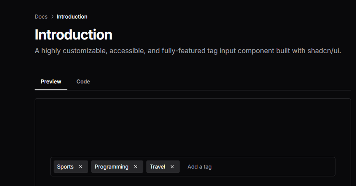
Emblor, by Jaleel Bennett, is a free, open-source tag input component for React, built on top of ShadCN UI’s Input, Popover, Command, and Dialog components. It leverages Tailwind CSS for utility-first styling, offering a highly customizable and accessible solution for managing tags in forms or interfaces. Emblor fits the All UtilityCSS platform’s Tailwind CSS List, ideal for developers building applications like task managers, blogs, or e-commerce platforms that need tag functionality with a utility-first approach.
#Features ⚡️
Tag Management: Add, remove, and edit tags with Tailwind-styled inputs.
Tailwind CSS Styling: Utility-first classes for layout, colors, and responsiveness.
Autocomplete: Suggest tags as users type, styled with Tailwind.
Drag-and-Drop: Reorder tags, with Tailwind CSS for visual feedback.
Customization: Style subcomponents (e.g., popover, tags) using Tailwind classes.
Accessibility: Keyboard navigation and WAI-ARIA compliance, enhanced by Tailwind’s responsive design.
Validation & Limits: Set max tags, character limits, and prevent duplicates.
#Pros and Cons
#Pros ✅
Highly customizable with Tailwind CSS for utility-first styling.
Free under MIT license, aligning with All UtilityCSS’s open-source focus.
Accessible and responsive with Tailwind’s sm:, md: utilities.
Active development, with 9 projects using it (npm data, March 2025).
Supports complex forms with React Hook Form and Zod integration.
#Cons ⚠️
Requires Tailwind CSS and ShadCN UI setup, adding initial configuration.
React-only, limiting use in non-React projects.
Learning curve for Tailwind CSS’s utility-first approach for new users.
Documentation could be more detailed for advanced customization.
#Included Components - Templates
Emblor provides components for tag input functionality:
TagInput: Core component for tag management, styled with Tailwind’s p-2 border.
Tag: Individual tag display with Tailwind’s flex items-center gap-2.
Popover: Displays tag suggestions, styled with Tailwind’s bg-white shadow-lg.
Clear All Button: Removes all tags, styled with Tailwind’s text-red-500.
#Pricing 💵
Emblor operates on a Free model:
Free Access: Fully open-source under the MIT license, installable via npm i emblor.
#Integrations 🧰
Emblor integrates with:
React: Core framework for the component.
Tailwind CSS: Utility-first styling for responsive design.
ShadCN UI: Built on its Input, Popover, and Command components.
React Hook Form: For form validation and management.
Zod: Schema validation for form data.
Frequently Asked Questions
What is Emblor, and how does it use Tailwind CSS?
It’s a free tag input component for React, styled with Tailwind CSS for utility-first design.
Is Emblor free to use?
Yes, it’s fully free under the MIT license.
Can I use Emblor with frameworks other than React?
No, it’s designed for React, aligning with Tailwind CSS List.
Does Emblor support accessibility?
Yes, with keyboard navigation and WAI-ARIA compliance.
Emblor
Highly customizable, accessible, component built with shadcn/ui.
Resource Types:
UI Kits :
Shadcn UITechnology Stack :


Have a product?
Submit your Shadcn product to AllShadcn, get featured, and drive genuine traffic while showcasing your work to the world. Turn your creativity into revenue and begin selling today! 🚀