Details about Glass UI
Beautiful collection of 50+ glassmorphism-inspired React components with frosted glass effects, subtle blurs, and vibrant accents.
Built with Tailwind CSS and Framer Motion for smooth animations and effortless customization.
Copy-paste ready with live previews and dark/light mode support out of the box.
Perfect for landing pages, dashboards, portfolios, and any app craving premium visual polish in 2025.
Free and open-source—designed to help developers create eye-catching interfaces without starting from scratch.
#What is Glass UI?
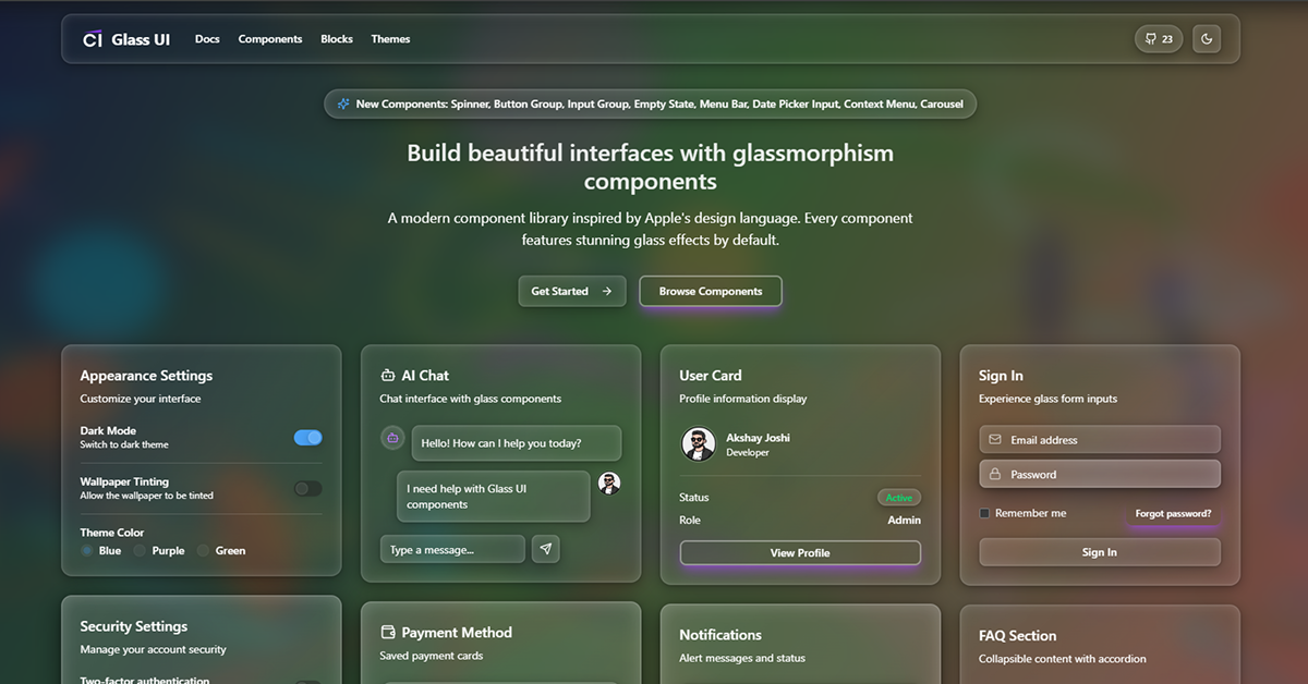
Glass UI is a sleek, modern React component library by Crenspire that brings the popular glassmorphism design trend to life with production-ready, highly customizable elements featuring translucent backgrounds, soft blurs, and elegant borders. Tailored for frontend developers, indie makers, and designers building visually striking web applications, it delivers instant aesthetic upgrades using Tailwind CSS for styling and Framer Motion for buttery-smooth micro-interactions—all while keeping implementation simple via copy-paste code snippets. Ideal for marketing sites, SaaS landing pages, creative portfolios, admin panels, and startup MVPs where first impressions matter, Glass UI helps you ship interfaces that feel premium and futuristic without wrestling with complex CSS filters or animation timing.
#Features ⚡
Authentic Glassmorphism: Backdrop blurs, semi-transparent layers, and vibrant border accents that adapt beautifully to any background.
Framer Motion Animations: Subtle hover lifts, scale effects, and fade-ins that enhance interactivity without overwhelming performance.
Tailwind-Powered Customization: Adjust blur intensity, opacity, colors, and borders directly via utility classes or config overrides.
Dark & Light Mode Ready: Components automatically respect prefers-color-scheme or manual toggles for seamless theming.
Responsive Design: Mobile-first layouts that maintain the glass effect across all device sizes.
Lightweight & Performant: Minimal runtime overhead with tree-shakable dependencies and optimized blur usage.
#Pros ✅
Instantly elevates any project with a premium, modern aesthetic that stands out in 2025 design trends.
Super easy to integrate—just copy, paste, and tweak with Tailwind—no new framework to learn.
Excellent documentation with live CodePen-style previews and variant options.
Completely free with generous licensing for personal and commercial use.
#Cons ⚠️
Heavy reliance on backdrop-filter may impact performance on very low-end devices (though mitigated with fallbacks).
Best suited for design-focused projects—may feel overstyled for minimalist or ultra-utilitarian apps.
Limited to aesthetic components; no complex form logic or data table primitives included.
#Included Components - Templates
Glass Cards: Frosted containers with hover effects, perfect for features, pricing, and testimonials.
Navigation Bars: Translucent headers with blur and subtle shadow lifts.
Buttons: Vibrant glass-style buttons with gradient borders and animated scale on hover.
Forms & Inputs: Elegant text fields and textareas with inner glow and floating labels.
Modals & Overlays: Full-screen or centered glass modals with smooth fade transitions.
Hero Sections: Pre-styled landing page heroes with layered glass elements.
Profile & Statistic Cards: User avatars, metric displays, and progress rings with glass backdrops.
Toggle Switches & Checkboxes: Stylized interactive controls that match the glass theme.
#Pricing 💸
Glass UI is 100% free for personal and commercial use under the MIT license. No paid tiers, no pro versions, no sign-up required—everything on the site is openly available to copy and use immediately. It's a passion project shared generously with the developer community.
#Integrations 🧰
Frameworks: Built for React with Next.js, Vite, Remix, and Astro projects.
Styling: Native Tailwind CSS v3+ with easy extension via config files.
Animation: Powered by Framer Motion for declarative, spring-based effects.
Deployment: Works flawlessly on Vercel, Netlify, Cloudflare Pages, and traditional hosting.
Design Tools: Complements Figma glassmorphism kits for consistent design-to-dev handoff.
Frequently Asked Questions
Do I need React to use Glass UI?
Yes—the components are React-based, but the underlying Tailwind and CSS patterns can inspire vanilla projects.
Is backdrop-filter supported everywhere?
Modern browsers support it well; fallbacks ensure graceful degradation on older ones.
Can I change the colors and blur intensity?
Absolutely—everything is controlled via Tailwind classes or CSS variables for full customization.
Glass UI
Glassmorphic components inspired by Apple’s modern design.
Resource Types:
UI Kits :
Shadcn UITechnology Stack :


Have a product?
Submit your Shadcn product to AllShadcn, get featured, and drive genuine traffic while showcasing your work to the world. Turn your creativity into revenue and begin selling today! 🚀