Details about Shadcn Resizable Sidebar
Drag-to-Resize: Allows users to adjust the sidebar width dynamically.
Collapsible: Supports smooth transitions between expanded and collapsed states.
Theme Support: Compatible with both light and dark modes.
Keyboard Shortcuts: Enables navigation via keyboard for accessibility.
Persistent State: Remembers user preferences using cookies.
Responsive Design: Optimized for desktop views; resizable functionality is disabled on mobile.
Built with Shadcn/ui: Utilizes Shadcn/ui components for a consistent UI experience.
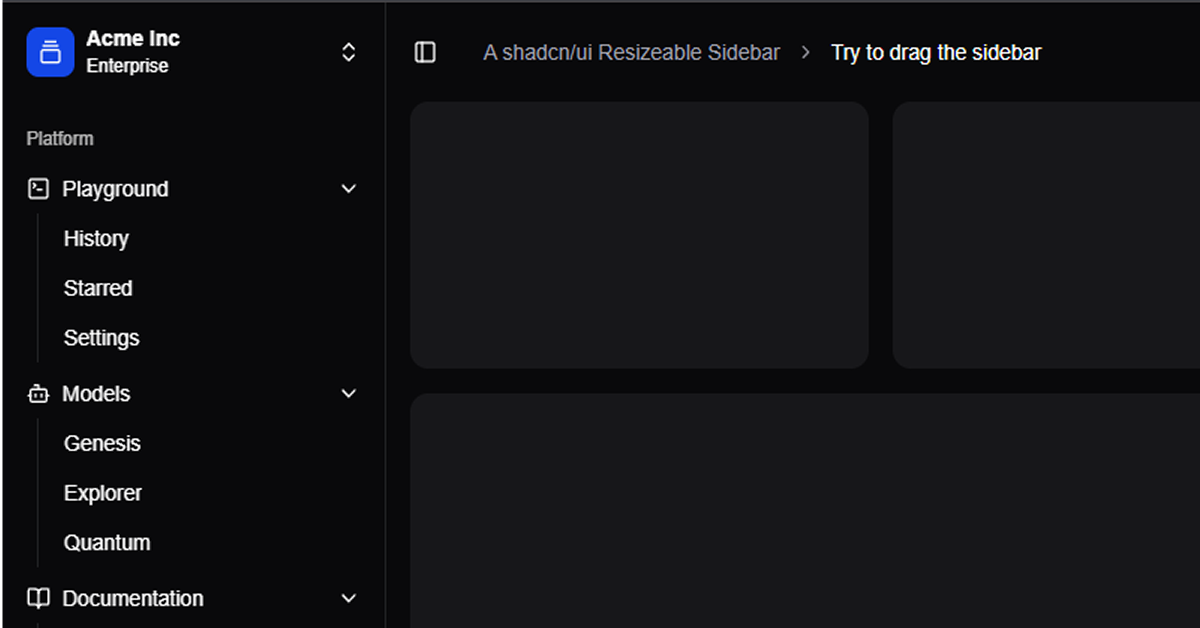
#What is Shadcn Resizable Sidebar?
The Shadcn Resizable Sidebar is an advanced sidebar component designed for React applications. It extends the functionality of the standard Shadcn/ui Sidebar by incorporating drag-to-resize capabilities, allowing users to adjust the sidebar width according to their preferences. This feature is particularly useful for applications that require a flexible layout, such as dashboards and admin panels. The component also supports collapsibility, theme switching, and keyboard navigation, ensuring a seamless and accessible user
#Features ⚡️
Drag-to-Resize: Users can click and drag the sidebar edge to resize it, providing a customizable layout.
Collapsible Sidebar: The sidebar can be collapsed to an icon-only view, maximizing screen real estate.
Theme Support: Automatically adapts to the system's light or dark mode settings.
Keyboard Navigation: Supports keyboard shortcuts for opening, closing, and resizing the sidebar.
Persistent State: Remembers the sidebar's state (open/closed, width) across sessions using cookies.
Responsive Design: The sidebar is resizable on desktop; on mobile devices, it switches to a collapsible drawer.
Built with Shadcn/ui: Leverages Shadcn/ui components for consistent styling and behavior.
#Pros and Cons
#Pros ✅
User-Friendly: Intuitive drag-to-resize and collapsible features enhance user experience.
Customizable: Easily integrates with existing React applications and can be styled using Tailwind CSS.
Accessible: Keyboard navigation and theme support ensure accessibility for all users.
Persistent State: Remembers user preferences across sessions, providing a consistent experience.
#Cons ⚠️
Mobile Limitations: Resizing functionality is disabled on mobile devices; a collapsible drawer is used instead.
Dependency on Shadcn/ui: Requires Shadcn/ui components, which may increase bundle size if not already in use.
#Included Components - Templates
The Shadcn Resizable Sidebar includes several components to facilitate its functionality:
ResizableSidebar: The main sidebar component that includes drag-to-resize and collapsible features.
SidebarContent: The main content area of the sidebar, where navigation links and other elements are placed.
SidebarTrigger: A button or icon that toggles the sidebar's visibility.
ResizableHandle: The draggable handle that allows users to resize the sidebar.
SidebarProvider: A context provider that manages the sidebar's state and persists it across sessions.
#Pricing 💵
The Shadcn Resizable Sidebar is open-source and available for free under the MIT license. There are no costs associated with using or modifying the component.
#Integrations 🧰
The Shadcn Resizable Sidebar integrates seamlessly with the following technologies:
React: Built specifically for React applications.
Shadcn/ui: Utilizes components from Shadcn/ui for UI elements.
Tailwind CSS: Styled using Tailwind CSS for easy customization.
Cookies: Uses cookies to persist the sidebar's state across sessions.
Frequently Asked Questions
Can I customize the sidebar's appearance?
Yes, the sidebar is styled using Tailwind CSS, allowing you to easily customize its appearance to match your application's design.
Does the sidebar support mobile devices?
On mobile devices, the sidebar switches to a collapsible drawer to provide a better user experience.
How does the sidebar remember user preferences?
The sidebar uses cookies to persist its state (open/closed, width) across sessions, providing a consistent experience for users.


Have a product?
Submit your Shadcn product to AllShadcn, get featured, and drive genuine traffic while showcasing your work to the world. Turn your creativity into revenue and begin selling today! 🚀