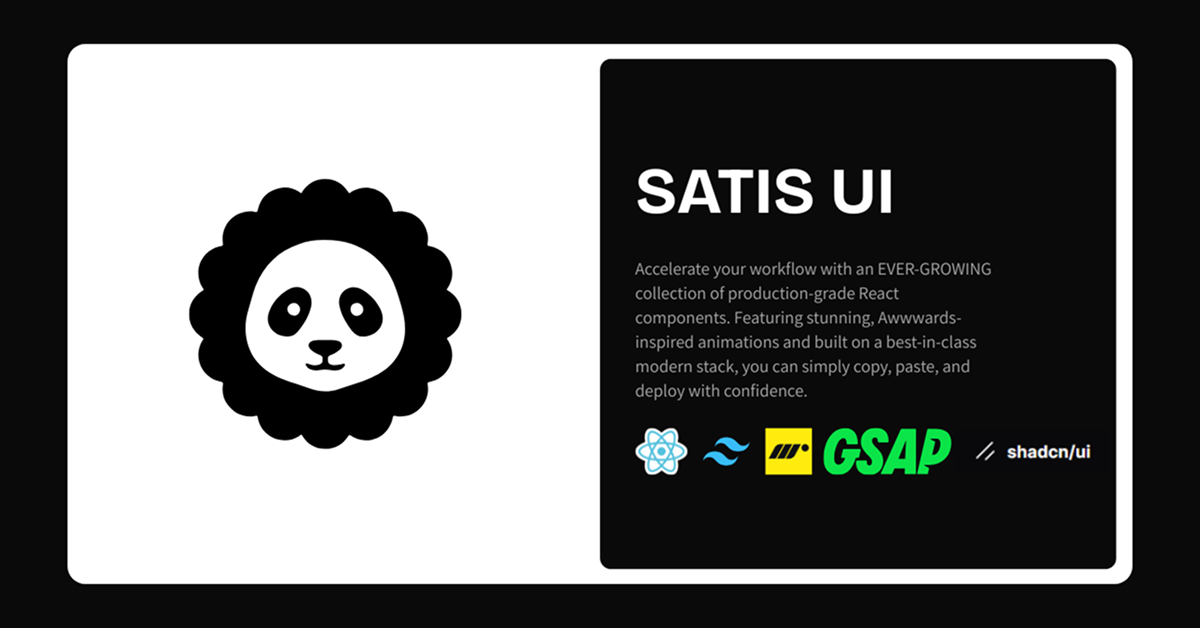
Details about Satis UI
Ever-growing collection of production-grade, animated React components built on shadcn/ui.
Features stunning, fluid animations using GSAP and Motion for premium feel.
Install via official shadcn CLI with registry URLs for seamless integration.
Categories include Carousels, Cards, Text Animations, Buttons, and Miscellaneous effects.
Focus on Awwwards-level design quality with scroll-linked, interactive, and hover-driven motions.
Upcoming SATIS UI PRO version for expanded access or extras.
#What is SATIS UI?
SATIS UI is a high-quality, open-source component library that extends the shadcn/ui ecosystem with beautifully animated, production-ready React components tailored for developers who want to elevate their UIs beyond basics. It's perfect for frontend engineers, designers, SaaS builders, agencies, and indie makers using React/Next.js + shadcn/ui who crave premium interactions—like fluid carousels, morphing buttons, scroll-reveal text, fanned card stacks, and hover-orchestrated cards—without sacrificing accessibility or dev speed. Powered by React, TypeScript, Tailwind CSS, GSAP, Framer Motion, and shadcn/ui primitives, it delivers core value through copy-paste (or CLI) deployment of Awwwards-inspired elements that feel intentional, performant, and modern—ideal for portfolios, landing pages, dashboards, product showcases, or any project needing standout motion design.
#Features ⚡
Awwwards-Inspired Animations: Fluid, scroll-linked, and physics-aware effects using GSAP and Motion for premium polish.
shadcn CLI Registry Integration: One-command adds like npx shadcn@latest add https://satisui.xyz/r/micro-expander.json handle deps and setup automatically.
Copy-Paste Ready: Full component code available for manual inclusion with clear docs and examples.
Categorized Components: Organized into Carousels (e.g., 3D Drifting Marquee, Fanned Card Stack), Cards (Animated Profile, Blog, CTA), Text Animations (Color Cycle, Typography Reveal), Buttons (Curtain, Morph), and more.
Interactive & Scroll-Driven: Features like hover orchestration, proximity effects, expanding grids, and swipeable stacks for engaging UX.
Modern Stack Alignment: Built with React, TypeScript, Tailwind, GSAP, Motion, and shadcn/ui for consistency and performance.
Live Docs & Previews: Detailed component pages with demos, variants (e.g., button states/sizes), and usage examples.
#Pros ✅
Brings high-end, award-winning motion design to shadcn/ui projects without heavy custom work.
Seamless CLI install feels native to shadcn/ui workflow—fast and dependency-smart.
Production-grade quality with focus on accessibility, theming, and real-world usability.
Growing library with fresh additions (e.g., latest: 3D Drifting Marquee).
Developer-friendly docs and examples make adoption quick and confident.
#Cons ⚠️
Requires GSAP and Motion dependencies (added automatically via CLI but increases bundle if not already present).
Animations may need tuning for very performance-sensitive or low-end devices.
Still evolving collection—some advanced patterns or categories may be added over time.
PRO version launching soon (details TBD), so core free version may have limits on future exclusives.
#Included Components - Templates
Carousels: 3D Drifting Marquee, Thumb Progress Carousel, Story Carousel, Fanned Card Stack.
Cards: Animated Profile Card, Blog Card, CTA Card, Focus Card (hover-orchestrated).
Text Animations: Color Cycle Text, Flipping Word Swap, Typography Reveal (scroll unit-by-unit).
Buttons: Curtain Button (variants: Default/Outline/Destructive/Ghost; sizes; states incl. loading/disabled), Morph Button.
Miscellaneous: Micro Expander (social actions: Like/Reply/Repost/Share), Expanding Grids, Proximity Image Row.
#Pricing 💸
Core library is free and open-source with full access to components, docs, and CLI registry.
No current paid tiers for the main collection.
#Integrations 🧰
shadcn/ui: Built on top with full CLI registry compatibility for easy adds.
React & Next.js: Primary framework targets.
Tailwind CSS: Core styling system.
GSAP & Framer Motion: Animation engines for advanced effects.
TypeScript: Fully typed components and props.
GitHub/Docs: Source and detailed guides at satisui.xyz/docs.
Frequently Asked Questions
Is SATIS UI free?
Yes—the core collection is free and open-source; PRO version is upcoming but not required.
How do I install components?
Use the shadcn CLI: npx shadcn@latest add
Does it require extra dependencies?
Yes—GSAP and Motion are needed (CLI adds them automatically).
Is it compatible with shadcn/ui?
Absolutely—designed as a direct extension with matching conventions and CLI support.
Satis UI
Beautifully Engineered Components for shadcn/ui
Resource Types:
UI Kits :
Shadcn UITechnology Stack :


Have a product?
Submit your Shadcn product to AllShadcn, get featured, and drive genuine traffic while showcasing your work to the world. Turn your creativity into revenue and begin selling today! 🚀