Details about ShadCN Spinner: Lightweight Loading Spinner
Free, open-source loading spinner component for shadcn-ui
Built with React, TypeScript, Tailwind CSS, and shadcn-ui
Displays animated loading indicators inspired by Radix UI
Easily integrated via shadcn CLI
MIT-licensed with active contributions
#What is ShadCN Spinner?
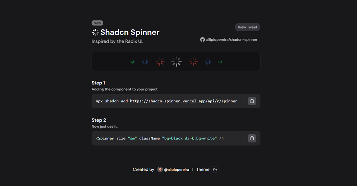
ShadCN Spinner is a free, open-source React component developed by allipiopereira, designed to enhance shadcn-ui with a lightweight, customizable loading spinner. It’s ideal for developers building web applications like dashboards, forms, or data-driven interfaces in Next.js or React projects, providing visual feedback during loading states such as data fetching, form submissions, or file uploads.
Built with React, TypeScript, Tailwind CSS, and shadcn-ui, it offers a smooth, animated spinner inspired by Radix UI’s design. The component integrates seamlessly via the shadcn CLI, ensuring consistency with shadcn-ui’s aesthetic and accessibility standards.
#Features ⚡️
Animated Loading Indicator: Smooth, customizable spinner for loading states.
Accessible Design: Inherits shadcn-ui’s WAI-ARIA compliance.
Responsive Styling: Tailwind CSS ensures adaptability across devices.
TypeScript Support: Type-safe for robust development.
Customizable: Easily styled via Tailwind classes or props.
#Pros and Cons
#Pros ✅
Seamless shadcn-ui Fit: Matches shadcn-ui’s design and accessibility.
Free and Open-Source: MIT license allows unrestricted use and customization.
Lightweight: Minimal footprint with no heavy dependencies.
Easy Integration: CLI command simplifies setup in shadcn-ui projects.
Active Support: Recent contributions (e.g., @BramSuurdje, November 2024) show ongoing development.
#Cons ⚠️
React Dependency: Limited to React/shadcn-ui ecosystems.
Setup Requirements: Needs shadcn-ui, Tailwind CSS, and React installed.
Single Purpose: Focused solely on loading spinners; no additional components.
Limited Variants: Offers basic customization compared to broader spinner libraries.
#Included Components
Spinner: A single, animated loading indicator with customizable size and styling.
#Pricing 💸
ShadCN Spinner is completely free under the MIT license, with no premium tiers.
#Integrations 🧰
React: Core framework for the component.
shadcn-ui: Provides accessible, styled primitives.
Tailwind CSS: Utility-first styling for responsive design.
Next.js: Optimized for Next.js projects.
TypeScript: Enhances type safety.
Frequently Asked Questions
What is ShadCN Spinner?
A lightweight loading spinner component for shadcn-ui, inspired by Radix UI, for React/Next.js projects.
Is it free?
Yes, it’s fully free under the MIT license.
Does it work outside shadcn-ui projects?
It’s designed for shadcn-ui; non-shadcn-ui use requires replacing dependencies.
ShadCN Spinner: Lightweight Loading Spinner
Displays an animated loading indicator, inspired by shadcn ui.
Resource Types:
UI Kits :
Shadcn UITechnology Stack :


Have a product?
Submit your Shadcn product to AllShadcn, get featured, and drive genuine traffic while showcasing your work to the world. Turn your creativity into revenue and begin selling today! 🚀