Details about Shadcraft Starter Kit
Paid UI kit with Figma components, blocks, templates, and Pro React code-fully aligned with shadcn/ui.
Includes 56+ components, 44+ blocks, 1500+ Lucide icons, and theming tools for light/dark modes.
Built with Figma variables, Tailwind CSS alignment, and tweakcn for instant sync between design and code.
Targets designers and devs needing pixel-perfect design-to-code parity; endorsed by shadcn creator (Oct 22, 2025).
One-time purchase with 1 year of updates.
#What is Shadcraft?
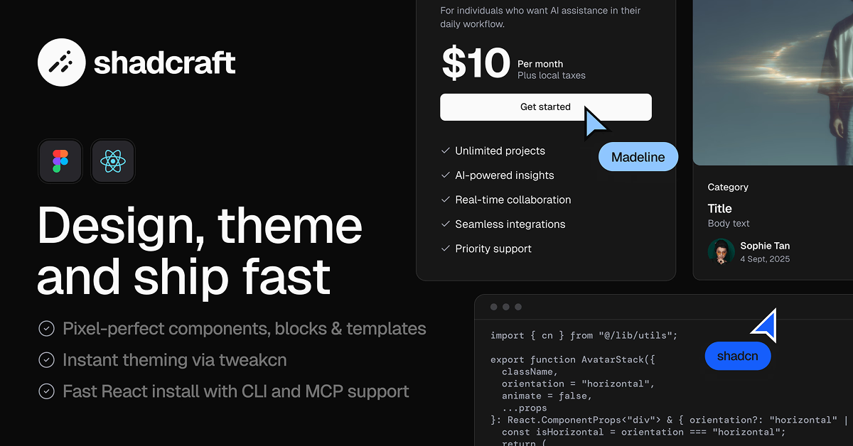
Shadcraft is a premium UI kit that bridges the gap between Figma design and shadcn/ui React development, offering ready-made components, blocks, and full-page templates to streamline consistent, production-ready interfaces. Created for teams building websites or apps, it ensures your Figma mockups translate seamlessly to code—eliminating handoff headaches and enabling faster iterations. Ideal for designers scaling design systems, developers using shadcn/ui, or agencies crafting marketing sites, Shadcraft leverages Figma's native features like variables and prototypes alongside tweakcn for real-time theming. With Tailwind-aligned spacing and typography, it's a powerhouse for maintaining brand consistency across light/dark modes, praised in community buzz for saving non-designers hours while delivering pro-level polish.
#Features ⚡️
Figma-Native Components: 56 shadcn/ui primitives (buttons, cards, modals) with variants and interactions.
Theming & Variables: CSS variables for colors, spacing, typography; tweakcn syncs changes instantly.
Light/Dark Mode Support: Built-in toggles and prototypes for seamless mode testing.
Bulk Assets: 44 blocks, 1500+ Lucide icons, and responsive layouts for quick assembly.
Pro Extras: Advanced components, content blocks, and full-page templates (e.g., landing pages, sales funnels).
React Parity (Pro React): Production-ready code blocks with CLI install and shadcn alignment.
#Pros ✅
Design-Code Harmony: Pixel-perfect Figma-to-React sync accelerates handoffs and reduces errors.
Comprehensive Coverage: 200+ assets handle most UI needs, from basics to marketing templates.
Customization Ease: Tailwind-aligned and tweakcn-powered for effortless theming without rebuilds.
One-Time Value: Unlimited projects, no subscriptions—endorsed by shadcn creator for credibility.
Figma Efficiency: Variables, prototypes, and bulk editing supercharge design workflows.
#Cons ⚠️
Paid-Only Access: No free tier—requires investment for core features (though Black Friday deals help).
Website-Focused: Strong for marketing sites; community requests more web-app specific components.
Limited Updates: One year post-purchase; may need repurchase for long-term projects.
Figma-Centric: React tier is Pro-only; less ideal for non-Figma teams.
Learning Curve: Best with shadcn/ui familiarity; new users may need tweakcn setup time.
#Included Components - Templates
Shadcraft packs a robust set of Figma and React assets, scaled by tier:
Components: 56 shadcn/ui essentials (e.g., Button with variants, Card, Dialog, Input, Select, Tabs).
Blocks: 44 pre-built sections (e.g., hero, features, testimonials, pricing grids).
Icons: 1500+ Lucide icons, fully integrated and themeable.
Templates (Pro): Full-page layouts for marketing sites, product pages, and sales funnels—responsive and interactive.
Pro React Extras: Matching code blocks with CLI install, e.g., animated heroes or form wrappers.
Theming Tools: Figma variables for Tailwind parity, plus prototype interactions for user flows.
These are modular - e.g., combine a Card block with Lucide icons for a feature showcase.
#Pricing 💸
Shadcraft uses a Tiered One-Time Purchase model with unlimited projects and 1-year updates:
Base: Core components, blocks, icons, variables, light/dark mode.
Pro: Base + premium components/blocks, full-page templates, responsive layouts.
Pro React: Pro Figma + React code parity, CLI install, production blocks.
Secure checkout via Lemon Squeezy; no subscriptions - great value for teams.
#Integrations 🧰
Designed for shadcn/ui workflows:
Figma: Native UI kit as team library; publish/enable across projects.
shadcn/ui: Direct compatibility—React tier matches primitives exactly.
Tailwind CSS: Aligned spacing, typography, and theming variables.
tweakcn: Theme editor for instant Figma-code sync.
React/Next.js: Pro React installs via CLI for App Router setups.
Lucide Icons: 1500+ integrated for consistent iconography.
Frequently Asked Questions
What is Shadcraft?
A premium Figma UI kit (with Pro React code) for shadcn/ui, featuring components, blocks, templates, and theming tools.
Can I theme Shadcraft components in Figma?
Yes - via variables and tweakcn for real-time updates.
Can I use Shadcraft for commercial projects?
Yes - unlimited use across projects.
Shadcraft Starter Kit
Complete shadcn/ui toolkit with pixel-perfect UI, theming, and blocks.
Resource Types:
- Tables
- Cards
- Tooltip
- Forms & Inputs
- Navigation
- Charts & Graphs
- Avatar
- Checkbox
- Buttons
- Accordion
- Sidebar
UI Kits :
Shadcn UITechnology Stack :


Have a product?
Submit your Shadcn product to AllShadcn, get featured, and drive genuine traffic while showcasing your work to the world. Turn your creativity into revenue and begin selling today! 🚀