Details about Stateful Button React
Free, open-source stateful button component that extends shadcn/ui’s Button.
Automatically manages loading, success, and error states for async operations.
Installs via npx shadcn@latest add — seamless integration with shadcn/ui CLI.
Built with TypeScript, Tailwind CSS, and Radix UI primitives for full accessibility.
Ideal for file uploads, API calls, form submissions, or any promise-based action.
#What is Stateful Button?
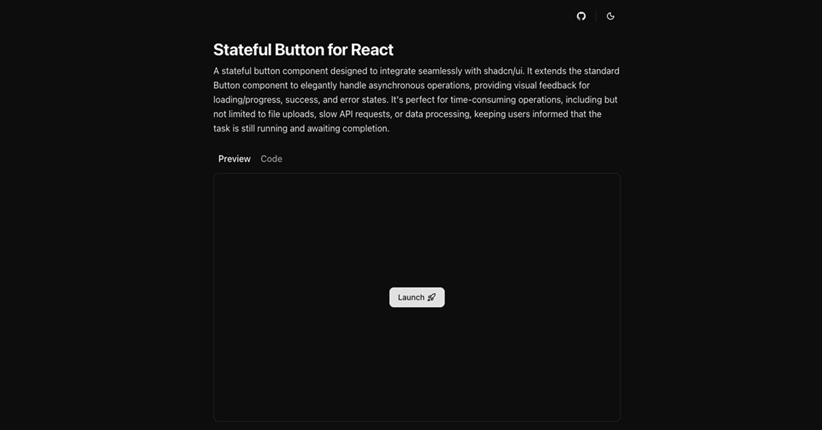
Stateful Button is a drop-in enhancement for shadcn/ui that transforms the standard Button into a smart, feedback-aware component. When paired with an async onClick handler, it automatically transitions through visual states:
Loading → spinner + disabled
Success → checkmark + brief confirmation
Error → warning icon + retry-ready
No manual state management needed. Perfect for user-facing interactions where delays occur—like uploading files, submitting forms, or calling slow APIs. It keeps users informed, reduces confusion, and enhances perceived performance—all while staying 100% compatible with your existing shadcn/ui design system.
#Features ⚡️
Zero-Config States: Pass a promise-returning onClick, and it handles loading/success/error automatically.
shadcn/ui Native: Inherits all variants, sizes, and styling from your Button component.
Accessible Feedback: ARIA labels, keyboard support, and screen reader announcements during state changes.
Customizable Durations: Success message lingers briefly before resetting; error state persists until retry.
Lightweight & Performant: No extra dependencies beyond shadcn/ui’s stack.
TypeScript-First: Full type safety for props, handlers, and return values.
#Pros ✅
Eliminates Boilerplate: No more isLoading, isSuccess, error state variables in every form.
Polished UX Out of the Box: Professional loading spinners, success checks, and error icons.
Perfect shadcn/ui Fit: Installs via official CLI, matches your theme and Tailwind config.
Free & Open-Source: MIT licensed, community-maintained, and fully transparent.
Great for Real-World Tasks: File uploads, payments, AI processing—any async flow benefits.
#Cons ⚠️
Promise-Only: onClick must return a Promise; sync actions won’t trigger state changes.
Single Purpose: Only enhances buttons—not inputs, modals, or full-page loaders.
No Built-in Retry Logic: Error state shows failure, but retry requires user re-click.
shadcn/ui Required: Not standalone—must be used within a shadcn/ui project.
Early Documentation: Examples are clear, but advanced customization guides are minimal.
#Included Components - Templates
The library includes one core component with full variant support:
StatefulButton: Extends shadcn/ui’s Button with async state logic. Supports all props: variant, size, asChild, disabled, etc. Example usage: <StatefulButton onClick={handleUpload}>Upload File</StatefulButton> → Shows spinner during upload → checkmark on success → warning on failure.
Also includes:
Default Variant Demo: Shows success and error flows side-by-side.
CLI Installation Template: Pre-configured JSON registry for npx shadcn@latest add.
#Pricing 💸
100% Free and Open-Source under the MIT license. No Pro version, no usage limits. Install, use, modify, and ship in any project—personal or commercial.
#Integrations 🧰
Designed exclusively for the shadcn/ui ecosystem:
shadcn/ui: Core dependency—uses same Button, Spinner, and icon system.
Tailwind CSS: Styled with utilities; inherits your theme’s colors, radius, and spacing.
React: Works with functional components and hooks.
TypeScript: Full typing for safety and IDE support.
Next.js: Compatible with App Router and Server Actions.
Vercel: Deployed demo and registry hosted at stateful-button.vercel.app.
Frequently Asked Questions
What is Stateful Button?
A smart wrapper around shadcn/ui’s Button that auto-handles loading, success, and error states for async actions.
Can I customize the icons or timing?
Yes—fork the component or override via slot props (planned in future updates).
Stateful Button React
Custom stateful button component designed to integrate seamlessly.
Resource Types:
UI Kits :
Shadcn UITechnology Stack :


Have a product?
Submit your Shadcn product to AllShadcn, get featured, and drive genuine traffic while showcasing your work to the world. Turn your creativity into revenue and begin selling today! 🚀