Details about Ui-Layouts - Your Frontend Universe
Free collection of 30+ ready-to-use UI blocks and components for rapid web and app development.
Pro version available for expanded features and additional blocks to supercharge projects.
Built for easy customization, targeting developers building modern sites with frameworks like React and Tailwind.
Open-source with active community contributions, encouraging stars and shares on GitHub.
Focuses on pre-built, copy-paste elements like heroes, testimonials, and interactive components.
#What is UI-Layouts?
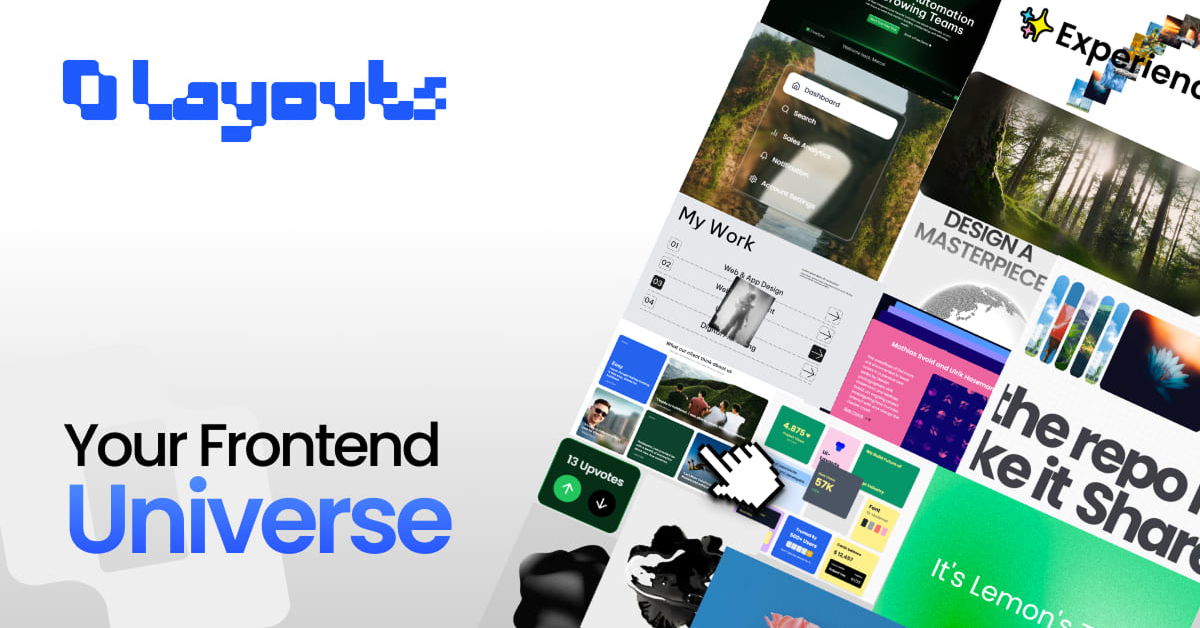
UI-Layouts is an open-source library serving as a "Frontend Universe" for developers, providing a curated set of ready-to-use UI blocks and components to accelerate building websites and applications. It emphasizes shipping faster by offering pre-built, customizable elements that fit seamlessly into projects, from landing pages to dashboards. Ideal for solo devs, agencies, or teams using modern stacks like React, Tailwind CSS, and potentially ShadCN UI integrations, it reduces boilerplate and design time. The free tier delivers core essentials, while the Pro upgrade unlocks premium blocks for more sophisticated layouts. With a vibrant community of contributors shaping its evolution, UI-Layouts promotes collaboration and sharing—star the repo to join the momentum and help it grow.
#Features ⚡️
Ready-to-Use Blocks: 30+ pre-built sections like heroes and pricing tables, designed for quick drop-in and full customization.
Interactive Components: Engaging elements such as accordions, galleries, and file uploads with smooth animations.
Customization-Friendly: Tailored for Tailwind CSS, allowing easy tweaks to colors, spacing, and responsiveness.
Preview Mode: Live demos for every block and component to test before integrating.
Open-Source Collaboration: Thrives on PRs and ideas from contributors, ensuring fresh, community-driven updates.
Cross-Framework Support: Works with React, Next.js, and similar setups for versatile frontend workflows
#Pros ✅
Rapid Prototyping: 30+ free blocks mean faster builds without starting from scratch, perfect for MVPs or client work.
High Customizability: Tailwind-based for pixel-perfect adjustments, keeping designs on-brand.
Community-Driven: Open-source with easy contribution paths, leading to reliable, evolving content.
Free Core Access: Solid starting library at no cost, with Pro for scaling up.
Engaging Variety: Mix of static blocks and dynamic components like mouse trails for modern, interactive UIs.
#Cons ⚠️
Pro Gated Content: Advanced blocks require upgrade, limiting free users to basics.
Framework Assumptions: Best with Tailwind/React; may need adaptations for vanilla CSS or other libs.
No Built-in CLI: Relies on copy-paste or manual integration, potentially slower for large-scale use.
Early Documentation: While previews help, detailed guides might be sparse for complex customizations.
Dependency on Community: Updates depend on contributors, so pace could vary.
#Included Components - Templates
UI-Layouts offers a diverse set of free blocks and components, each with live previews for immediate testing. Highlights include:
Blocks: Hero sections for impactful intros, Experience timelines for user journeys, Testimonial carousels for social proof, About pages for storytelling, Feature grids for product highlights, Pricing tables for conversions, Newsletter sign-ups for leads, and FAQs for support.
Components: Accordion for collapsible content, Globe for 3D interactive maps, Mouse Trail for fun cursor effects, Gallery for image showcases, DateTime Input for form handling, Tags Input for multi-select fields, File Upload with drag-and-drop, and Scroll Text Marquee for dynamic text scrolls. These are modular and stackable, e.g., combine a Hero block with a Globe component for an engaging landing page.
#Pricing 💸
UI-Layouts uses a Free model:
Free Tier: Full access to 30+ blocks and core components—no limits on use, ideal for personal projects or testing.
#Integrations 🧰
Built for modern frontend stacks:
Tailwind CSS: Core styling foundation for responsive, utility-driven customizations.
React/Next.js: Seamless component imports for dynamic apps and SSR.
ShadCN UI: Compatible for layered theming on primitives like buttons and inputs.
GitHub: Repo starring and forking for version control and contributions.
Design Tools: Previews exportable to Figma for handoff.
Build Tools: Works with Vite or Webpack for bundling in any JS/TS project.
Frequently Asked Questions
What is UI-Layouts, and how does it speed up development?
It's a free/open-source hub of 30+ UI blocks and components, pre-built for copy-paste use—customize with Tailwind to launch sites faster without design overhead.
Is the free tier sufficient for production?
Yes, with 30+ versatile blocks like heroes and testimonials; Pro adds extras for complex needs.
Which frameworks does it support?
Primarily React and Tailwind CSS, but adaptable to Vue or static HTML with minor tweaks.
Ui-Layouts - Your Frontend Universe
More Than Components, It's Your Frontend Universe
Resource Types:
UI Kits :
Tailwind UITechnology Stack :


Have a product?
Submit your Shadcn product to AllShadcn, get featured, and drive genuine traffic while showcasing your work to the world. Turn your creativity into revenue and begin selling today! 🚀