Details about Async Select Component
Tech Stack: React, TypeScript, Tailwind CSS, shadcn/ui
Features: Asynchronous select component with search and preload capabilities
UI Components: Utilizes
<Popover />and<Command />from shadcn/uiCustomization: Supports custom filtering, loading states, and empty results messages
Demo & Code: Interactive examples and source code available at async.rdsx.dev
#What is Async Select component?
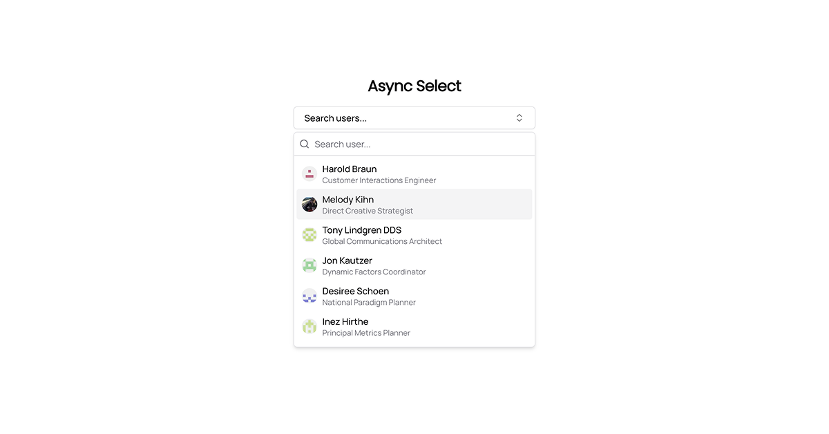
The Async Select component, developed by Rudro Dip Sarker, is a versatile React component designed to handle asynchronous data fetching for select inputs. Built using shadcn/ui's <Popover /> and <Command /> components, it offers a seamless user experience with features like search functionality, preloading options, and customizable UI elements. This component is ideal for applications requiring dynamic data loading and user-friendly interfaces.
#Features ⚡️
Asynchronous Data Fetching: Fetch options dynamically using the
fetcherprop.Search Functionality: Allows users to search through options efficiently.
Preload Mode: Option to preload all options for faster access.
Custom Filtering: Implement custom filtering logic with the
filterFnprop.Customizable UI: Render options and selected values using custom components.
Loading and Empty States: Display custom loading skeletons and "no results" messages.
Accessibility: Built with accessibility in mind, ensuring a wide range of users can interact with the component.
TypeScript Support: Fully typed for enhanced developer experience.
#Pros and Cons
#Pros ✅
Seamless Integration: Easily integrates into React applications using shadcn/ui.
Customizable: Offers extensive customization options for rendering and styling.
Performance Optimized: Supports preloading and custom filtering for efficient data handling.
User-Friendly: Provides a smooth and intuitive user interface.
Open Source: Freely available for use and modification.
#Cons ⚠️
Dependency on shadcn/ui: Requires shadcn/ui components, which may not be suitable for all projects.
Learning Curve: May require some time to understand and implement effectively.
Limited Documentation: Documentation may not cover all advanced use cases.
#Included Components – Templates
The Async Select component includes:
AsyncSelect Component: The main component for rendering the select input.
Popover and Command Components: Utilized from shadcn/ui for dropdown functionality.
Custom Render Functions: Functions for rendering options and selected values.
Loading and Empty State Components: Components for displaying loading indicators and "no results" messages.
TypeScript Interfaces: Interfaces for type safety and autocompletion.
#Pricing 💵
The Async Select component is open-source and free to use. There are no licensing fees or subscription costs associated with utilizing this component.
#Integrations 🧰
The Async Select component integrates with:
shadcn/ui: For UI components like
<Popover />and<Command />.React: For building the component and handling state.
TypeScript: For type safety and autocompletion.
Custom Data Fetching Logic: Allows integration with various data sources and APIs.
Frequently Asked Questions
How do I integrate the Async Select component into my project?
You can integrate the component by importing it into your React component and passing the required props, such as fetcher, renderOption, and getOptionValue.
Can I customize the appearance of the Async Select component?
Yes, the component allows customization through the renderOption and getDisplayValue props, as well as custom styling using Tailwind CSS.
Is the Async Select component accessible?
Yes, the component is built with accessibility in mind, ensuring compatibility with screen readers and keyboard navigation.
Does the Async Select component support multiple selections?
The current implementation supports single selection. For multiple selections, you may need to extend the component's functionality.
Async Select Component
Modern and customizable async select component for React applications.
Resource Types:
UI Kits :
Shadcn UITechnology Stack :


Have a product?
Submit your Shadcn product to AllShadcn, get featured, and drive genuine traffic while showcasing your work to the world. Turn your creativity into revenue and begin selling today! 🚀