Details about Shadcn Country Dropdown
Free, open-source country dropdown and phone input components for shadcn-ui
Built with React, TypeScript, Tailwind CSS, shadcn-ui, react-circle-flags, and country-data-list
Supports single/multiple country selection, flags, and phone input with validation
Integrates via shadcn CLI
MIT-licensed
#What is Shadcn Country Dropdown?
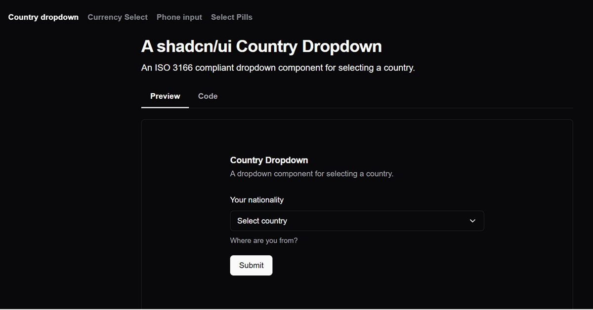
Shadcn Country Dropdown is a free, open-source React component library by uixmat, designed to extend shadcn-ui with ISO 3166-compliant country dropdown and phone input components. It’s ideal for developers building forms requiring country selection or phone number input, such as user profiles, checkout pages, or international registration systems, in Next.js or React projects.
Built with React, TypeScript, Tailwind CSS, shadcn-ui, react-circle-flags, and country-data-list, it offers a searchable country dropdown with flags, single/multiple selection modes, and a phone input with international call prefixes. The components integrate via shadcn CLI or as an NPM package (Shadcn Country Dropdown), ensuring alignment with shadcn-ui’s accessible, customizable design.
#Features ⚡️
Country Dropdown:
Searchable: Filter countries by name with real-time search.
Single/Multiple Selection: Choose one or multiple countries (Zod-compatible for multiple).
Flag Display: Shows country flags using react-circle-flags.
Slim/Inline Variants: Compact flag-only or inline display options.
ISO 3166 Compliance: Uses country-data-list for alpha-2/alpha-3 codes.
Phone Input:
International Prefixes: Auto-detects country calling codes.
Validation: Uses libphonenumber-js for phone number validation.
Linked with Dropdown: Syncs country selection with phone prefix.
Accessible Design: Inherits shadcn-ui’s WAI-ARIA compliance.
Form Integration: Supports react-hook-form and Zod for validation.
#Pros and Cons
#Pros ✅
shadcn-ui Compatibility: Matches shadcn-ui’s aesthetic and accessibility.
Free and Open-Source: MIT license allows unrestricted use and customization.
Feature-Rich: Supports flags, multiple selection, and phone input linkage.
Flexible Installation: CLI for shadcn-ui projects or NPM for broader use.
Community Engagement: 208 stars and X posts show growing traction (June 2025).
#Cons ⚠️
React Dependency: Limited to React/shadcn-ui ecosystems.
Setup Requirements: Needs shadcn-ui, Tailwind CSS, and additional dependencies (react-circle-flags, country-data-list, libphonenumber-js).
Client-Side Focus: Validation and rendering are client-side; server-side logic requires custom setup.
Dependency Overhead: Multiple external libraries increase bundle size.
Limited Customization: Phone input styling is shadcn-ui-centric, requiring overrides for non-shadcn projects.
#Included Components
CountryDropdown: Searchable dropdown for single or multiple country selection with flags.
PhoneInput: Input field for phone numbers with country code prefixes and validation.
SelectPills: Pill-style UI for multiple country selection with search and badges.
CurrencySelect: ISO 4217-compliant currency selector using country-data-list.
#Pricing 💸
Shadcn Country Dropdown is completely free under the MIT license, with no premium tiers.
#Integrations 🧰
React: Core framework for components.
shadcn-ui: Provides accessible primitives (Button, Command, Popover, etc.).
Tailwind CSS: Utility-first styling for responsive design.
Next.js: Optimized for Next.js projects.
TypeScript: Ensures type safety.
react-circle-flags: Renders country flags.
country-data-list: Supplies ISO 3166/4217 country and currency data.
libphonenumber-js: Validates phone numbers for PhoneInput.
react-hook-form & Zod: Supports form validation and state management.
Frequently Asked Questions
What is Shadcn Country Dropdown?
A shadcn-ui component library with ISO-compliant country dropdown and phone input for forms.
Is it free?
Yes, it’s fully free under the MIT license.
Does it work outside shadcn-ui projects?
It’s designed for shadcn-ui; non-shadcn-ui use requires replacing dependencies or using the NPM package.


Have a product?
Submit your Shadcn product to AllShadcn, get featured, and drive genuine traffic while showcasing your work to the world. Turn your creativity into revenue and begin selling today! 🚀