Details about Multi-Select Component Setup in Next.js
Free, open-source multi-select component for shadcn-ui
Built with React, TypeScript, Tailwind CSS, shadcn-ui, and cmdk
Features search, clear all, max selection limit, and animations
Integrates via shadcn CLI
MIT-licensed, actively maintained by sersavan
#What is Multi-Select Component?
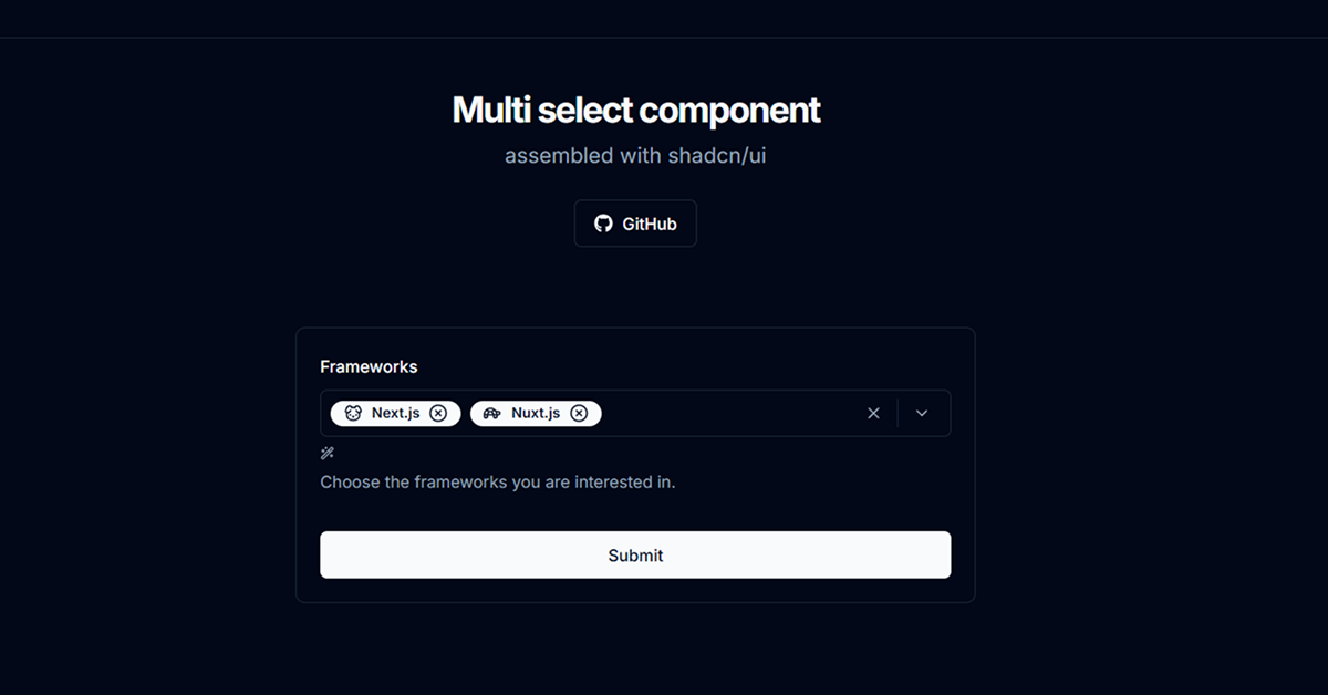
Multi-Select Component is a free, open-source React component by sersavan, designed to extend shadcn-ui with a customizable multi-select dropdown. It’s ideal for developers building forms, filters, or tag selectors in Next.js or React projects, such as user preference settings or category tagging systems.
Built with React, TypeScript, Tailwind CSS, shadcn-ui, and cmdk, it offers features like searchable options, a clear all button, maximum selection limits, and animated transitions. The component integrates seamlessly via shadcn CLI, ensuring alignment with shadcn-ui’s accessible, polished design. It addresses community demand for a native multi-select solution, as seen in shadcn-ui discussions (October 2023).
#Features ⚡️
Searchable Options: Filter options with a built-in search input.
Clear All & Close: Buttons to reset selections or close the dropdown.
Max Selection Limit: Restrict the number of selectable items (e.g., maxCount=3).
Custom Icons: Support for icons (e.g., lucide-react) per option.
Animations: Optional animated transitions for selected items (via animation prop).
Accessible Design: Inherits shadcn-ui’s WAI-ARIA compliance.
Variants: Styling variants (e.g., default, inverted) via class-variance-authority.
#Pros and Cons
#Pros ✅
shadcn-ui Compatibility: Matches shadcn-ui’s aesthetic and accessibility.
Free and Open-Source: MIT license allows unrestricted use and customization.
Feature-Rich: Includes search, limits, and animations for enhanced UX.
Easy Integration: CLI setup simplifies adding to shadcn-ui projects.
#Cons ⚠️
React Dependency: Limited to React/shadcn-ui ecosystems.
Setup Requirements: Needs shadcn-ui, Tailwind CSS, cmdk, and dependencies like lucide-react.
Client-Side Focus: Built on cmdk, which is client-side; server-side interactions need extra setup.
Complexity: Advanced features like animations may require configuration tweaks.
No Creatable Options: Lacks support for creating new options (unlike some alternatives).
#Included Components
MultiSelect: Main component for rendering a multi-select dropdown with search, badges, and controls.
Command Components: Leverages shadcn-ui’s Command, CommandInput, and CommandItem for search and selection.
#Pricing 💸
Multi-Select Component is completely free under the MIT license, with no premium tiers.
#Integrations 🧰
React: Core framework for the component.
shadcn-ui: Provides accessible, styled primitives.
Tailwind CSS: Utility-first styling for responsive design.
Next.js: Optimized for Next.js projects.
TypeScript: Ensures type safety.
cmdk: Powers command palette-style search and selection.
lucide-react: Icon library for option visuals.
react-hook-form & Zod: Supports form integration (optional).
Frequently Asked Questions
What is Multi-Select Component?
A multi-select dropdown for shadcn-ui with search, max limits, and animations.
Is it free?
Yes, it’s fully free under the MIT license.
Does it work outside shadcn-ui projects?
It’s designed for shadcn-ui; non-shadcn-ui use requires replacing dependencies.


Have a product?
Submit your Shadcn product to AllShadcn, get featured, and drive genuine traffic while showcasing your work to the world. Turn your creativity into revenue and begin selling today! 🚀