Details about Shadcn Loaders
Collection of 20+ beautifully crafted, premium React loading animations designed to match shadcn/ui aesthetics.
Powered by Framer Motion for smooth, performant animations and Tailwind CSS for seamless styling.
Copy-paste ready components with built-in customization, variants, and dark/light mode support.
Perfect for adding professional polish to loading states in dashboards, forms, and data-heavy apps.
One-time purchase Pro access unlocks full library—ideal for developers valuing quality over quantity in 2025.
#What is Shadcn Loaders?
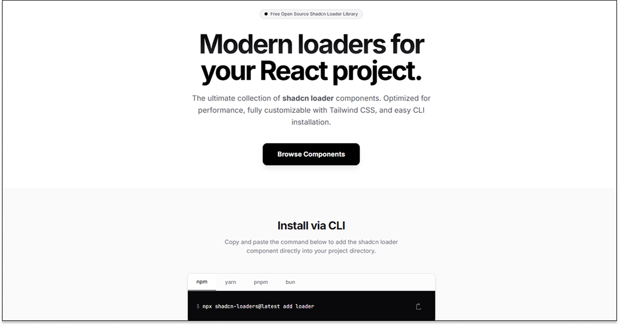
Shadcn Loaders is a premium collection of React loading components created to complement shadcn/ui projects, offering developers high-quality, animated spinners and skeletons that integrate effortlessly with Tailwind CSS and popular React frameworks. Aimed at frontend engineers building modern SaaS apps, admin panels, or any interface needing elegant loading feedback, its core value is delivering ready-to-use animations that feel native to shadcn's design language—complete with customizable colors, sizes, speeds, and variants—without the hassle of building from scratch. Built on Framer Motion for fluid performance and TypeScript for safety, it's ideal for Next.js or Vite setups where consistent, delightful UX elevates the entire application.
#Features ⚡
Premium Animations: Hand-crafted spinners, dots, bars, skeletons, and orbital effects with natural easing and loops.
Framer Motion Driven: Declarative variants for hover, state changes, and seamless transitions.
Full Customization: Props for color (via Tailwind classes), size, duration, and custom CSS overrides.
shadcn/ui Compatible: Matches radii, shadows, and theming for pixel-perfect integration.
Dark Mode Ready: Automatic adaptation or manual control for consistent appearance.
Lightweight & Performant: Minimal dependencies, tree-shakable, and optimized for production.
#Pros ✅
Exceptional visual quality that instantly upgrades loading experiences to premium feel.
Perfect stylistic match for shadcn/ui users—no clashing designs or extra theming work.
Easy copy-paste with live previews and variant options for quick implementation.
One-time payment model supports unlimited use across projects.
#Cons ⚠️
Paid access required—no free tier beyond previews or limited demos.
Smaller library (20+) focused on quality; may need supplements for ultra-niche loaders.
Requires Framer Motion and Tailwind setup; not suited for non-React or vanilla projects.
#Included Components - Templates
Classic Spinners: Ring, dual-ring, and pulse variations with color gradients.
Dot Loaders: Bouncing, chasing, and scaling dots in multiple layouts.
Bar & Progress: Horizontal bars, indeterminate loaders, and waveform effects.
Skeleton Screens: Card, text, and avatar placeholders with shimmer animations.
Orbital & Unique: Planet-style orbits, hourglass flips, and grid pulses.
Advanced Variants: Combined effects like spinner + text, or fullscreen overlays.
#Pricing 💸
Shadcn Loaders follows a straightforward one-time purchase model for lifetime access: Pro license at a single payment (details on site, typically affordable for developers), unlocking the full 20+ component library, source code, future updates, and commercial usage rights. No subscriptions, no recurring fees—pay once and use forever across all your projects.
#Integrations 🧰
Frameworks: Native for React, Next.js (App Router/Pages), Vite, and Remix.
Animation: Framer Motion for core effects and variant handling.
Styling: Tailwind CSS with shadcn/ui components for theming consistency.
State Tools: Works with any loading state management (React Query, SWR, etc.).
Deployment: Optimized for Vercel, Netlify, and static builds.
Frequently Asked Questions
Are these compatible with shadcn/ui?
Yes—designed specifically to match shadcn's design tokens, radii, and shadows for seamless blending.
Do I need Framer Motion?
Yes—it's the animation engine; install it alongside for full functionality.
Is dark mode supported?
Fully—components adapt automatically or via class props.
Shadcn Loaders
Beautiful, fast React loaders. Copy paste ready and shadcn friendly.
Resource Types:
UI Kits :
Shadcn UITechnology Stack :


Have a product?
Submit your Shadcn product to AllShadcn, get featured, and drive genuine traffic while showcasing your work to the world. Turn your creativity into revenue and begin selling today! 🚀