Shadcn Button Components
Explore a variety of customizable Shadcn buttons for your web projects. Make your design interactive and catchy.
Explore Buttons


91+ Shadcn Buttons
Submit Resource

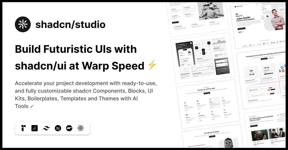
shadcn/studio
Open-source Shadcn registry with copy-paste components.

PDFx: shadcn/ui for React PDFs
Pre-built PDF components for React. Copy them into your project


Starwind UI
Set of powerful, accessible components for your Astro projects.

Joly UI
Custom registry of composable, accessible components for shadcn/ui.

NativeUI
Accessible React Native components via shadcn registry. Open source.
Pixelact UI
Pixel art React components on shadcn/ui. Open source & customizable.

Use layouts
Modern animated React components & micro-interactions for conversion


CSS Snippets
Freemium, ready-to-use snippets for modern HTML, CSS, and React.

Glass UI
Glassmorphic components inspired by Apple’s modern design.


ScrollX UI – Interactive React Components for Modern UIs
Create stunning interfaces with handcrafted components.

21st.dev
Explore, copy, and remix thousands of high-quality React components


Basecoat
A components library built with TailwindCSS that works with web stack.

Shadcn Buttons Collection
Welcome to the Shadcn Buttons Collection, featuring a versatile set of button components built with the Shadcn UI library and styled using Tailwind CSS. Buttons are essential interactive elements in any web application, and our collection offers beautifully designed, highly customizable buttons that enhance user experience and streamline your development process.
What Are Shadcn Buttons?
Shadcn Buttons are pre-designed, reusable button components that provide consistent styling and behavior across your projects. Created with the power of Tailwind CSS and Shadcn UI, these buttons come in various styles, sizes, and states, including primary, secondary, outlined, disabled, loading, and icon buttons.
They are built to be fully accessible and responsive, ensuring that users enjoy a seamless interaction regardless of the device or assistive technology they use.
Key Features of Shadcn Buttons
Multiple Variants: Includes primary, secondary, outline, ghost, and link button styles to fit different UI contexts.
Size Options: From small to large, buttons can be adjusted to match the design and usability needs.
State Management: Built-in support for disabled, loading, and active states to improve feedback and usability.
Icon Support: Easily add icons inside buttons to enhance visual communication.
Accessibility: Keyboard navigable and screen reader friendly to comply with accessibility standards.
Customizable: Utilize Tailwind CSS utility classes for quick style adjustments or extend with your own styles.
Responsive Design: Buttons adapt gracefully to different screen sizes, ensuring usability on mobile and desktop.
Consistent UI: Provides a uniform look and feel across your application, improving brand coherence.
Who Should Use Shadcn Buttons?
Developers: Accelerate UI development with ready-to-use, well-tested button components.
UI/UX Designers: Ensure consistent and accessible button design across projects.
Product Teams: Improve user engagement with intuitive and visually appealing call-to-action buttons.
Businesses & Startups: Build polished and professional web applications that impress users.
Why Choose Shadcn Buttons?
Shadcn Buttons offer an ideal balance between design flexibility and developer convenience. Thanks to the modular nature of Shadcn UI and the utility-first styling of Tailwind CSS, you can effortlessly customize buttons to meet your branding and functionality needs without rewriting code.
The collection’s focus on accessibility and responsive design means your buttons will work well for all users, including those relying on assistive devices. This commitment to usability, combined with consistent aesthetics, helps improve user satisfaction and overall application quality.
Conclusion:
The Shadcn Buttons Collection is a comprehensive toolkit for adding interactive, stylish, and accessible buttons to your web projects. Designed for maximum flexibility and ease of use, these buttons empower developers and designers alike to create engaging user interfaces quickly and efficiently.
Whether you need simple call-to-action buttons or complex interactive controls with icons and loading states, Shadcn Buttons provide a reliable and customizable foundation. Explore the collection today to enhance your application's interactivity and deliver a seamless user experience.
Frequently Asked Questions
Explore frequently asked questions about Buttons
Customizable, accessible button components in Shadcn UI for React.
Primary, secondary, destructive, outline, ghost, and link.
Have a product?
Submit your Shadcn product to AllShadcn, get featured, and drive genuine traffic while showcasing your work to the world. Turn your creativity into revenue and begin selling today! 🚀