Shadcn Table Components
Discover the collection of the best Shadcn table components for responsive, & customizable data displays.
Explore Tables


63+ Shadcn Tables
Submit Resource
Starwind UI
Set of powerful, accessible components for your Astro projects.

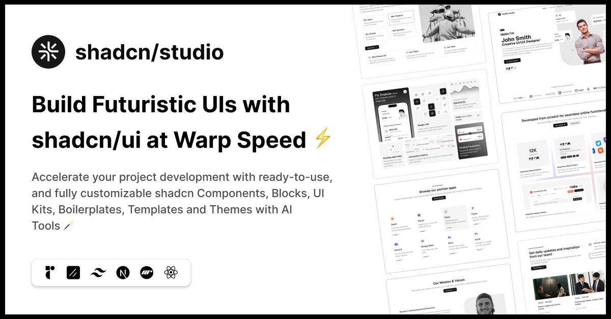
shadcn/studio
Open-source Shadcn registry with copy-paste components.


Glass UI
Glassmorphic components inspired by Apple’s modern design.


ScrollX UI – Interactive React Components for Modern UIs
Create stunning interfaces with handcrafted components.

21st.dev
Explore, copy, and remix thousands of high-quality React components

UI TripleD
UI components, blocks, and landing page templates powered by shadcn/ui

Shadcraft Starter Kit
Complete shadcn/ui toolkit with pixel-perfect UI, theming, and blocks.

PaceUI
Smooth, rich animated components you can copy, customize, and use.

Coss UI
Modern Base UI + shadcn/ui components built for developers and AI.


Intent UI
Intent UI offers accessible, Tailwind-ready React components.


RetroUI - Component Library
Retro styled component library built with React and TailwindCSS.

Shadcn Data Table Resize Columns
Simple example how to add very basic column-resizing option DataTable.


Supercharged Shadcn Component
Build faster with ready-to-use React components inspired by shadcn/ui.

TNKS Data Table
Advanced data table component with server-side operations.
Shadcn Tables Collection
Welcome to the Shadcn Tables Collection, your go-to source for high-quality, customizable table components designed with Shadcn UI and Tailwind CSS. Whether you're building dashboards, admin panels, or data-driven web applications, our collection of tables offers powerful and flexible solutions to display and manage complex data efficiently.
What Are Shadcn Tables?
Shadcn Tables are pre-built, modular table components built on top of the Shadcn UI system and styled using Tailwind CSS. These tables come with essential features such as sorting, filtering, pagination, row selection, and customizable columns, providing developers with the tools needed to present data clearly and interactively.
Crafted for both simplicity and advanced use cases, Shadcn Tables support responsive design, accessibility standards, and easy integration into modern frontend frameworks.
Key Features of Shadcn Tables
Rich Functionality: Includes sorting, filtering, pagination, and row selection to help users navigate large data sets effortlessly.
Customizable Layouts: Modify column widths, styles, and behavior to suit your specific UI needs.
Responsive Design: Tables adjust seamlessly across devices, ensuring usability on desktops, tablets, and mobiles.
Accessibility Focused: Built to support keyboard navigation and screen readers, making your data accessible to all users.
Lightweight & Performant: Optimized for fast rendering and minimal resource use, even with large datasets.
Easy Integration: Designed to work smoothly with React, Next.js, and other frameworks, accelerating your development process.
Consistent Styling: Powered by Tailwind CSS and Shadcn UI, ensuring a uniform look across your application.
Who Should Use Shadcn Tables?
Developers & UI Engineers: Save development time with ready-to-use, customizable table components.
Product Teams: Build interactive dashboards that empower users with data insights.
Business Intelligence Applications: Present complex data with clarity and efficiency.
Admin Panels & CMS: Manage records, users, and inventory with intuitive table interfaces.
Why Choose Shadcn Tables?
Shadcn Tables offer a balanced combination of flexibility, ease of use, and powerful features tailored to meet modern web application requirements. Their modular architecture allows for effortless customization without sacrificing performance or accessibility.
Built using Tailwind CSS’s utility-first approach, these tables enable quick styling adjustments, letting developers focus more on functionality and user experience. Moreover, the strong emphasis on accessibility means your application will cater to a broader audience.
Conclusion:
The Shadcn Tables Collection provides a versatile and reliable foundation for displaying and managing data in your web applications. Whether you are creating simple lists or complex data grids with advanced interactivity, these tables ensure your project is both user-friendly and performant.
Leveraging Shadcn UI and Tailwind CSS, these table components deliver consistent styling, responsiveness, and rich features that adapt to diverse business needs. Explore the collection now and enhance your application's data presentation with clean, accessible, and customizable tables.
Frequently Asked Questions
Explore frequently asked questions about Tables
A set of styled, accessible React components for rendering tables.
Use npx shadcn-ui@latest add table to add table components.
Have a product?
Submit your Shadcn product to AllShadcn, get featured, and drive genuine traffic while showcasing your work to the world. Turn your creativity into revenue and begin selling today! 🚀