Details about Kanpeki
Free, open-source React component library
Built with React, TypeScript, Tailwind CSS
Features customizable, accessible UI with minimal bundle size
Supports composition patterns and WAI-ARIA compliance
MIT-licensed with 17 GitHub stars
#What is Kanpeki?
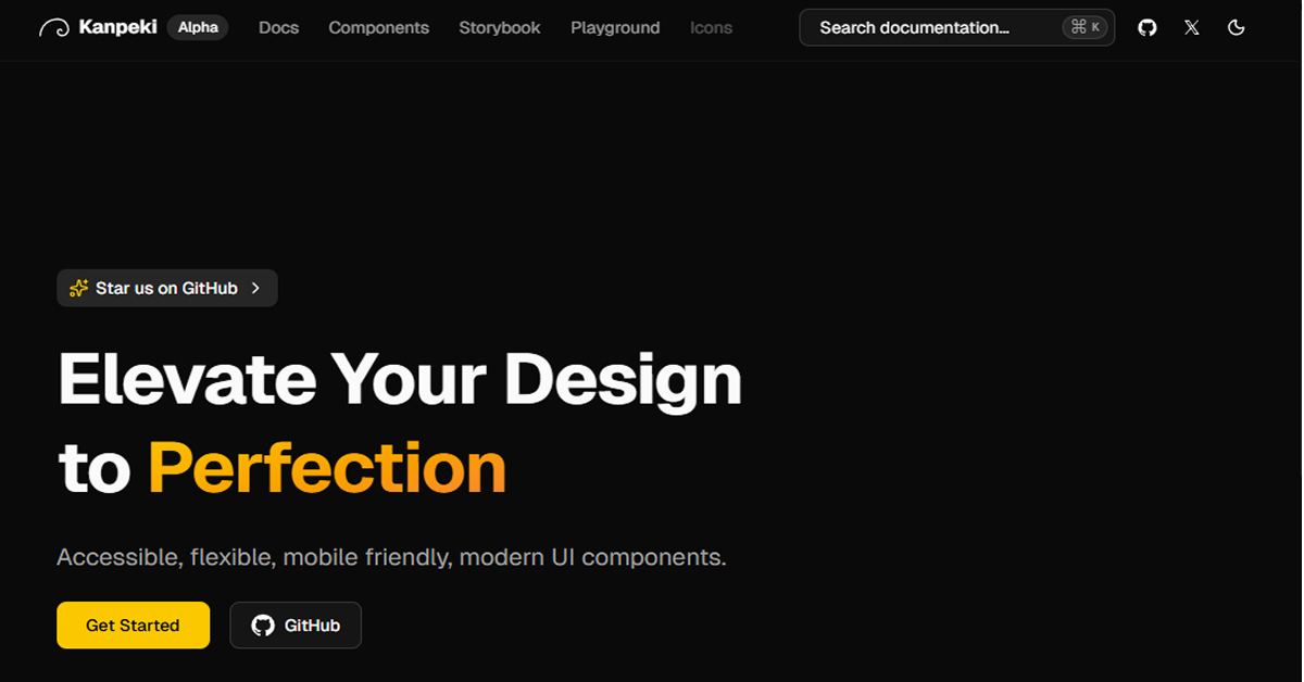
Kanpeki is a free, open-source React component library designed to help developers build accessible, flexible, and mobile-friendly modern web applications. Its primary goal is to provide high-quality, customizable UI components that prioritize accessibility and performance, targeting React developers creating responsive interfaces for websites, dashboards, or apps. Built with React, TypeScript, and Tailwind CSS, Kanpeki offers a range of components that follow WAI-ARIA guidelines, include keyboard support, and use composition patterns for extensibility. It emphasizes no runtime styles, minimal bundle sizes, and TypeScript-first development, allowing users to install only needed components. As a lightweight alternative to heavier libraries, Kanpeki focuses on simplicity and ownership, enabling developers to contribute and shape its future. For React enthusiasts seeking accessible UI, Kanpeki is a perfect fit, leveraging Tailwind's utility-first approach to deliver optimized, maintainable components for modern applications.
#Features ⚡️
Fully Customizable: Easily adjust appearance and behavior to match your brand.
Accessible Design: WAI-ARIA compliant with keyboard support and focus management.
No Runtime Styles: Tailwind CSS-based, eliminating unnecessary classes and bundle bloat.
Minimal Bundle Size: Install only required components to keep your app lightweight.
TypeScript-First: Built with TypeScript for type-safe applications and out-of-the-box definitions.
Composition Pattern: Extend and compose components effortlessly for flexibility.
#Pros ✅
Accessibility Focus: Built-in WAI-ARIA and keyboard support ensures inclusive UI.
Free and Open-Source: MIT license with community contributions encouraged.
Lightweight Performance: Minimal bundle sizes and no runtime styles optimize loading.
Customizable Styling: Tailwind CSS enables quick, utility-based modifications.
Type-Safe Development: TypeScript reduces errors and improves developer experience.
Composition-Friendly: Easy to extend components for complex UIs.
#Cons ⚠️
React Dependency: Limited to React projects, no support for other frameworks.
Setup Complexity: Requires Tailwind CSS and TypeScript configuration.
Limited Scope: Smaller library may lack components in larger alternatives.
Learning Curve: Familiarity with Tailwind and composition patterns needed.
Early Stage: 17 GitHub stars indicate limited adoption and testing.
#Included Components - Templates
Kanpeki provides a variety of accessible React components:
Buttons: Customizable buttons with variants and loading states.
Forms: Input fields, selects, and checkboxes with validation.
Modals: Accessible dialogs with focus trapping and keyboard navigation.
Cards: Responsive cards for content display and layouts.
Navigation: Menus and tabs with ARIA roles for screen readers.
Tables: Data tables with sorting, filtering, and pagination.
#Pricing 💸
Kanpeki operates on a Free model:
Free Access: All components available under MIT license.
No Pro Version: No premium features or paid tiers.
#Integrations 🧰
Kanpeki integrates with:
React: Core framework for component rendering.
Tailwind CSS: Utility-first styling for responsive design.
TypeScript: Full type support for safe development.
Frequently Asked Questions
What is Kanpeki, and how does it work with ShadCN UI?
Kanpeki is a free React library with accessible components using Tailwind CSS, complementary to shadcn UI for similar ecosystems.
Is Kanpeki free to use?
Yes, fully open-source under MIT license.
Can I use Kanpeki with frameworks other than React?
No, designed for React ecosystems.
Kanpeki
Accessible, flexible, mobile friendly, modern UI components.
Resource Types:
UI Kits :
Shadcn UITechnology Stack :


Have a product?
Submit your Shadcn product to AllShadcn, get featured, and drive genuine traffic while showcasing your work to the world. Turn your creativity into revenue and begin selling today! 🚀