Details about Oui
Free, open-source library of accessible React UI components built on React Aria primitives.
Designed for seamless integration with shadcn/ui—use side-by-side without conflicts.
Copy-and-paste ready with no build step or additional configuration required.
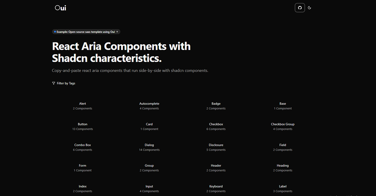
Over 130 components organized by tags (e.g., Alert, Button, Dialog) for easy discovery.
Focuses on accessibility while mimicking shadcn's customizable, unstyled philosophy.
#What is Oui?
Oui is a lightweight, developer-friendly collection of React components powered by React Aria, crafted to deliver high accessibility standards while blending effortlessly into shadcn/ui workflows. It addresses the need for robust, ARIA-compliant primitives in modern React apps, allowing you to enhance forms, modals, and interactions without overhauling your existing setup. Ideal for teams building inclusive web apps—like dashboards, e-commerce sites, or tools—Oui ensures keyboard navigation, screen reader support, and semantic markup out of the box. By maintaining shadcn-like characteristics (e.g., Tailwind-friendly styling), it lowers the barrier for devs prioritizing UX without sacrificing speed or simplicity. As an open-source project, it's perfect for prototyping or production, emphasizing drop-in usability over complex dependencies.
#Features ⚡️
React Aria Foundation: Leverages Adobe's React Aria for battle-tested accessibility primitives like focus management and ARIA roles.
Shadcn Compatibility: Components styled to match shadcn/ui's aesthetic—pair with your existing buttons or cards seamlessly.
Tag-Based Organization: Filter and browse by categories (e.g., Form, Dialog) for quick access to relevant elements.
No-Build Integration: Pure copy-paste JSX—no npm installs, bundlers, or configs needed.
Customizable Variants: Tailwind classes baked in for easy theming, responsiveness, and dark mode support.
Interactive Demos: Live previews on the site for testing before implementation.
#Pros ✅
Accessibility Boost: React Aria ensures WCAG compliance, making inclusive design effortless.
Zero Friction Setup: Copy-paste simplicity integrates faster than full library installs.
Shadcn Harmony: Enhances without replacing—ideal for hybrid shadcn projects.
Free & Lightweight: Open-source with no bloat; no runtime overhead.
Developer-Centric: Tag filtering and demos streamline discovery and iteration.
#Cons ⚠️
Limited Scope: Focuses on Aria-enhanced primitives; fewer full templates than comprehensive UI kits.
Styling Assumptions: Relies on Tailwind for customization—less ideal for CSS-in-JS setups.
No CLI Support: Manual copy-paste vs. automated installers like shadcn's.
Evolving Documentation: Site previews are strong, but in-depth guides are minimal.
React-Only: Tailored for React; no Vue or Svelte adapters yet.
#Included Components - Templates
Oui provides over 130 modular components, grouped by tags for targeted use, all as copy-paste React snippets:
Alert (2 variants): Dismissible notifications with ARIA live regions.
Autocomplete (4): Searchable dropdowns with keyboard filtering.
Badge (2): Pill-shaped labels with hover states.
Button (13): Core interactive elements with loading, icon, and group variants.
Checkbox (6): Single/multi-select with indeterminate states.
Dialog/Modal (17 total): Overlays with trap focus and escape handling.
Form Elements: Input (4), Select (5), Text Field (3), Number Field (3), Search Field (3), Text Area (2).
Navigation: Menu (8), Tabs (2), List Box (5), Popover (2), Tooltip (4).
Other Highlights: Card (1), Slider (4), Switch (6), Table (3), Toggle Button (2), Sidebar (1).
These are standalone but composable—e.g., combine Button with Dialog for accessible modals.
#Pricing 💸
Oui is completely free and open-source under the MIT license. No tiers, subscriptions, or premium features—all components available via the site for personal or commercial use. Contributions encouraged via GitHub to expand the collection.
#Integrations 🧰
Focused on the React accessibility stack:
shadcn/ui: Direct compatibility—mix components in the same project for hybrid UIs.
React Aria: Core primitives for focus, keyboard, and ARIA automation.
Tailwind CSS: Utility classes for styling and responsiveness.
React: Built for functional components and hooks.
Next.js/Vite: Works in any bundler; no special config needed.
Lucide Icons: Often paired for accessible iconography.
Frequently Asked Questions
What is Oui?
A free library of React Aria components styled like shadcn/ui, for accessible, copy-paste UIs.
Is Oui free to use?
Yes—MIT open-source; no costs for any project.
How do I integrate it with shadcn/ui?
Copy-paste components alongside your shadcn ones—they share Tailwind styling.
Oui
React Aria components that integrate smoothly with Shadcn UI.
Resource Types:
UI Kits :
Shadcn UITechnology Stack :


Have a product?
Submit your Shadcn product to AllShadcn, get featured, and drive genuine traffic while showcasing your work to the world. Turn your creativity into revenue and begin selling today! 🚀