Details about Berlix UI – Animated React Components Library
Tech Stack: React, TypeScript, Tailwind CSS, Framer Motion
Features: Pre-built animated components for UI elements
Installation: Easy integration via CLI or npm
Customization: Fully customizable animations and styles
Documentation: Comprehensive guides and examples
#What is Berlix UI?
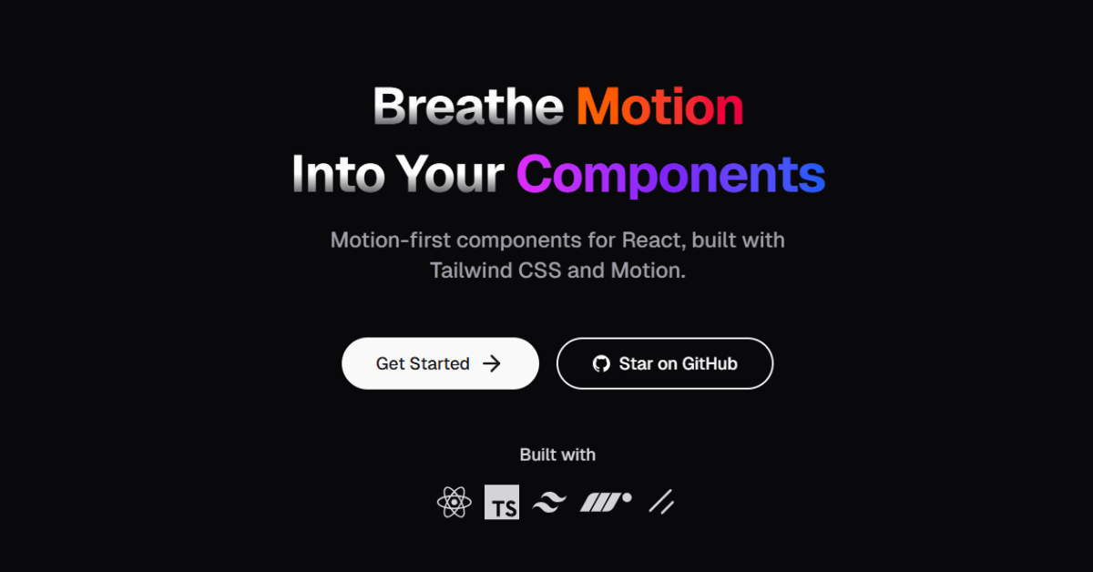
Berlix UI is an open-source, animation-first component library designed for React and Next.js applications. Built with Tailwind CSS and Framer Motion, it offers a collection of pre-built, customizable animated components that can be seamlessly integrated into your projects. Whether you're developing marketing sites, dashboards, or SaaS applications, Berlix UI provides motion-rich UI elements to enhance user engagement.
#Features ⚡️
Pre-built Animated Components: Includes components like Text Reveal, Flip Card, and Gradient Bars.
Motion-First Design: Utilizes Framer Motion for smooth animations.
Tailwind CSS Integration: Easily customizable styles using Tailwind CSS.
CLI Installation: Quick setup with commands like
npx shadcn@latest add "https://berlix.vercel.app/registry/text-reveal.json".Responsive Design: Components are designed to be mobile-friendly.
Accessibility: Built with accessibility in mind, ensuring components are usable by all users.
Comprehensive Documentation: Detailed guides and examples to assist with integration and customization.
#Pros and Cons
#Pros ✅
Easy Integration: Quickly add components to your project with minimal setup.
Customizable: Tailwind CSS integration allows for easy styling adjustments.
Enhances User Experience: Smooth animations improve user engagement.
Open Source: Free to use and modify.
Active Development: Regular updates and additions to the component library.
#Cons ⚠️
Limited Component Library: May not cover all UI needs; additional components may need to be developed.
Learning Curve: New users may need time to familiarize themselves with Framer Motion and Tailwind CSS.
Performance Considerations: Overuse of animations can impact performance; use judiciously.
#Included Components – Templates
Berlix UI offers a variety of animated components:
Text Effects: Text Circle, Text Reveal, Text Ripple, Text Scramble, Text Split.
Forms: Checkbox, Input.
Navigation: Menu Fluid, Menu Vertical.
Cards: Book, Flip Card, Tilt Card.
Backgrounds: Gradient Bars.
Each component is designed to be easily customizable and can be integrated into your project with minimal effort.
#Pricing 💵
Berlix UI is open-source and free to use. There are no licensing fees or subscription costs associated with utilizing this component library.
#Integrations 🧰
Berlix UI integrates seamlessly with:
React: For building user interfaces.
Next.js: For server-side rendering and static site generation.
Tailwind CSS: For utility-first styling.
Framer Motion: For animations and transitions.
These integrations ensure that Berlix UI components work smoothly within your existing React or Next.js projects.
Frequently Asked Questions
Can I customize the animations?
Yes, Berlix UI components are built with Framer Motion, allowing you to customize animations to fit your project's needs.
Are the components mobile-friendly?
Yes, all components are designed to be responsive and work well on mobile devices.
Is there documentation available?
Yes, comprehensive documentation is available on the Berlix UI website, including guides and examples.
Berlix UI – Animated React Components Library
Open-source UI library crafted for sleek, animated interfaces.
Resource Types:
UI Kits :
Tailwind UITechnology Stack :


Have a product?
Submit your Shadcn product to AllShadcn, get featured, and drive genuine traffic while showcasing your work to the world. Turn your creativity into revenue and begin selling today! 🚀