Details about Fancy Components
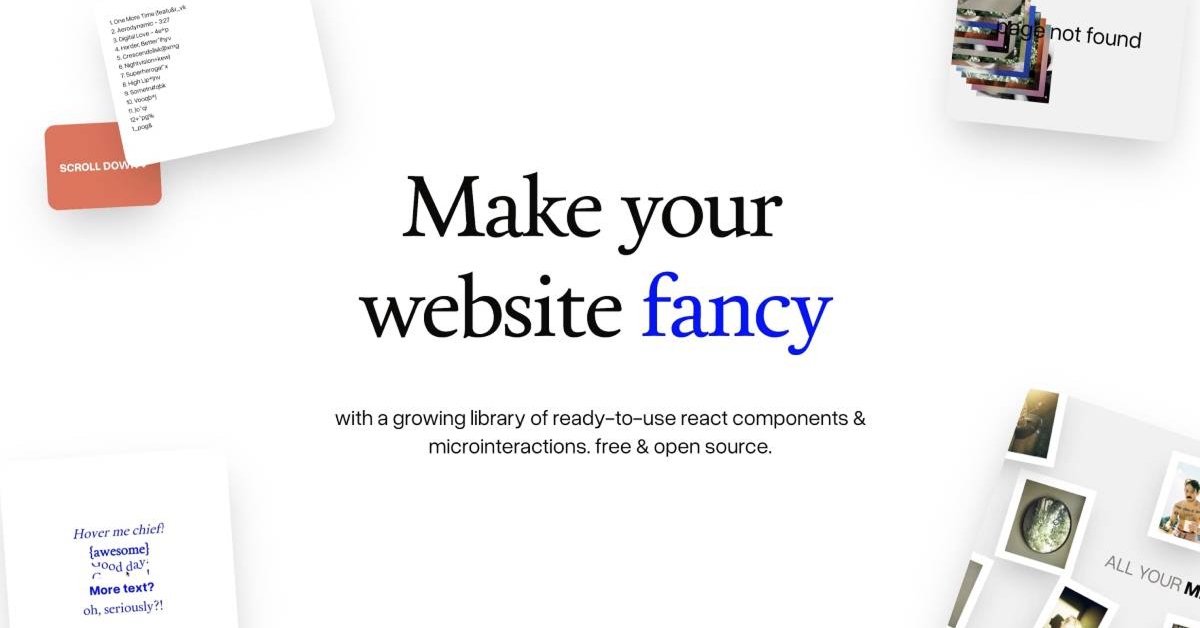
Growing library of fancy, quirky, fun, and animated React components & micro-interactions
Completely free and open-source — no paywalls, no tiers
Built as a shadcn/ui-style registry for easy CLI installation and copy-paste usage
Focus on expressive, whimsical effects: text animations, variable font interactions, stacking cards, and more
Perfect for adding personality, delight, and "weird" vibes to modern web apps
Inspired by and built upon shadcn/ui — same philosophy of ownership and customization
#What is Fancy Components?
Fancy Components is a delightful, open-source collection of ready-to-use React components and micro-interactions created for frontend developers who want to inject fun, personality, and visual excitement into their websites without heavy dependencies or complex setup. Its core value is making the web "fun again" with quirky, animated elements that stand out—think playful text effects, interactive stacking cards, variable font reactions, and other creative touches that add whimsy and engagement. Powered by React, TypeScript, Tailwind CSS, and often Framer Motion or similar for animations, it's ideal for use-cases like creative portfolios, experimental landing pages, marketing sites that want to feel edgy and alive, or any project where you want to break from boring minimalism and add memorable flair — all while keeping full code ownership and easy integration.
#Features ⚡
Quirky & Fun Animations: Variable font cursor proximity effects, animated text highlighters, stacking cards with interactive layers, and more creative motion
shadcn/ui-Style Registry: Install via pnpm dlx shadcn add @fancy/component-name — components drop into your project with full source code
Easy Customization: Tailwind classes, CSS variables, and composable structure for tweaking to your brand
Live Documentation: Clean docs site with interactive previews, usage examples, and "Open in v0" links for quick experimentation
TypeScript Ready: Full typing for safe, productive development
Performance Focus: Lightweight design with smooth, non-intrusive animations
#Pros ✅
Brings genuine joy and personality to UIs — perfect for projects that want to stand out and feel human
Completely free & open-source — no barriers to experimentation or production use
High-quality motion and creativity without the usual bloat or complexity
Familiar shadcn-style workflow — easy to adopt if you're already in the ecosystem
Community-driven and growing — inspired by shadcn philosophy of ownership
#Cons ⚠️
Quirky/fun focus means not ideal for ultra-professional enterprise apps (better for creative or consumer-facing)
Still a growing library — fewer components than massive established ones
Some effects (e.g., variable fonts) require specific assets or browser support
#Included Components - Templates
Fancy Components offers a growing, whimsical set of components and effects: Stacking Cards for layered interactive displays; Text Highlighter with directional animations; Variable Font Cursor Proximity for proximity-based font variation; plus various micro-interactions, animated text effects, playful loaders, and creative blocks — all with live previews, code snippets, and registry-ready installation.
#Pricing 💸
Fancy Components is completely free and open-source — no tiers, subscriptions, or premium upsells. Access every component, the docs, and source code unlimited for personal, commercial, or experimental projects at zero cost.
#Integrations 🧰
Fancy Components integrates natively with shadcn/ui CLI and ecosystem; Tailwind CSS for styling; React + TypeScript for development; Framer Motion (for some animations); v0.dev for previews/generation; plus any modern React framework like Next.js or Vite — deployable on Vercel or similar.
Frequently Asked Questions
Is Fancy Components free?
Yes — 100% free and open-source with no restrictions.
What's the vibe?
Fun, quirky, weird, animated — designed to make the web more playful and expressive.
Requires shadcn/ui?
Yes — built as a compatible extension for shadcn projects.
Fancy Components
Ready-to-use fancy React components. Free and open source.
Resource Types:
UI Kits :
Shadcn UITechnology Stack :


Have a product?
Submit your Shadcn product to AllShadcn, get featured, and drive genuine traffic while showcasing your work to the world. Turn your creativity into revenue and begin selling today! 🚀