Shadcn Navigation Components
Curated collection of Shadcn navigation components, including navbars, sidebars, dropdowns, and more.
Explore Navigation


34+ Shadcn Navigation
Submit Resource

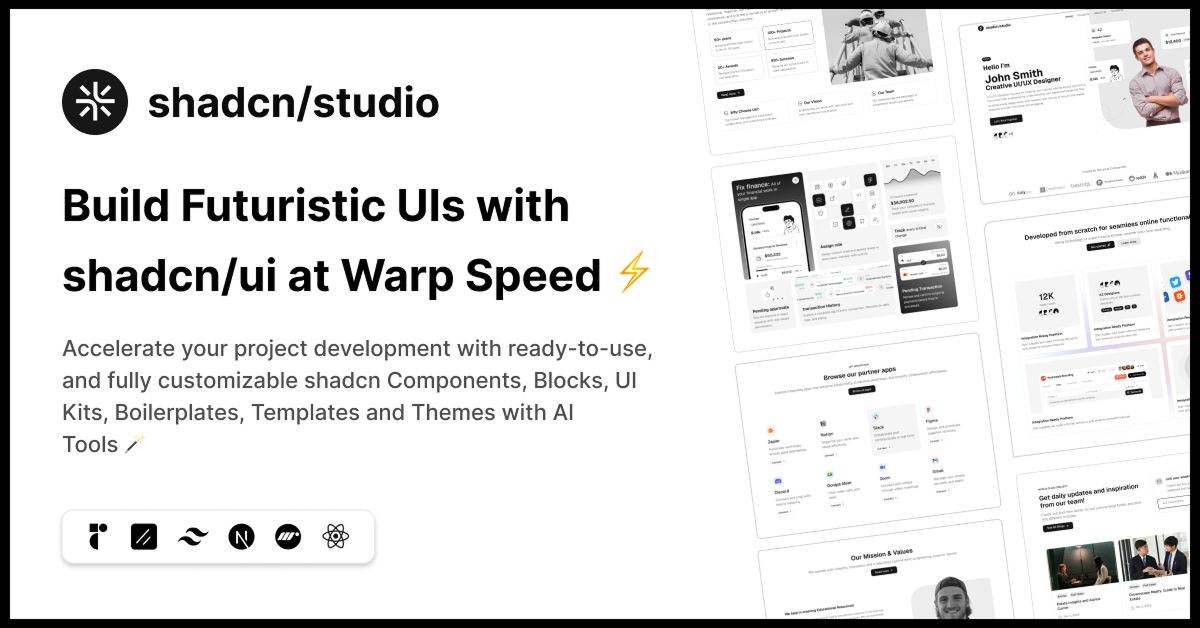
shadcn/studio
Open-source Shadcn registry with copy-paste components.

Terrae - Beautiful maps made simple
Beautifully designed, accessible, and customizable map components.

Mapcn - Beautiful maps made simple
Beautiful map components. 100% Free, Zero config, one command setup.

Alpine Registry
A example registry for distributing code using shadcn.

21st.dev
Explore, copy, and remix thousands of high-quality React components

Basecoat
A components library built with TailwindCSS that works with web stack.

Shadcraft Starter Kit
Complete shadcn/ui toolkit with pixel-perfect UI, theming, and blocks.

Intent UI
Intent UI offers accessible, Tailwind-ready React components.

Spectrum UI: Beautiful React Component Collection
Beautifully designed, accessible React components built with Tailwind.

HextaUI - Build stunning websites effortlessly
Modern, responsive, customizable UI components for Next.js.

Glasscn UI
Themable shadcn/ui component library with glassmorphism variants.

BuouUI
Beautiful UI library with components and templates using Tailwind CSS

Animated Tabs
Discover a new way to manage projects and collaborate with your team.

React Native Reusables
Shadcn/ui for React Native featuring collection of components

Sysinfocus simple/ui
A Fresh Take on Building Beautiful UI Components.

Storybook - Frontend workshop for UI development
It is a frontend workshop for building UI components in isolation.

UI Thing – The Ultimate UI Toolkit
Re-usable components built using TailwindCSS inspired by shadcn/ui.

Spartan
Cutting-edge tools powering Angular full-stack development.

Shadcn Kotlin
Accessible and customizable components' library. Free. Open Source.

Craft Design System
Flexible design system for responsive layouts in React website.
Best Shadcn Navigation Components
Navigation is the backbone of any user interface. It guides users through your application, providing structure and ease of use. When building modern React applications with Shadcn UI: a popular component library built on Radix UI and Tailwind CSS understanding how to implement and customize navigation components is crucial for delivering a seamless user experience.
At All Shadcn components collection, you'll explore Shadcn navigation components in depth: what they are, how they work, and best practices to use them effectively in your projects.
What Are Shadcn Navigation Components?
Shadcn UI offers a set of highly customizable, accessible, and modern navigation components designed to help developers build clean and responsive navigation systems quickly. Built on top of Radix UI’s unstyled accessible primitives and styled with Tailwind CSS, Shadcn navigation components combine accessibility best practices with beautiful design out-of-the-box.
These components include:
Navigation Menu: Multi-level dropdown navigation menus.
Tabs: Organize content into tabs for easy access.
Breadcrumbs: Display the user's location within a site hierarchy.
Context Menus: Right-click or long-press menus for contextual actions.
Sidebars: Vertical navigation panels, often collapsible.
Menus: Simple dropdown menus for actions and links.
Why Use Shadcn Navigation Components?
Accessibility First: Every component is built following WAI-ARIA best practices, ensuring keyboard navigation and screen reader support.
Tailwind CSS Powered: Easily customize the look and feel using Tailwind's utility-first classes.
Composable & Flexible: Components can be combined and extended to fit any UI pattern or requirement.
TypeScript Ready: Strongly typed for better DX and fewer runtime errors.
Lightweight: Minimal styling overhead, enabling you to build performant applications.
Key Shadcn Navigation Components Explained
1. Navigation Menu
The Shadcn Navigation Menu is perfect for creating complex multi-level drop-down commonly found in website headers. It supports keyboard navigation, focus management, and ARIA roles.
Use cases:
Website main menus with drop-down.
App navigation with nested options.
2. Tabs
Tabs help segment content into discrete views within the same page, making your UI cleaner and easier to scan.
Use cases:
Settings panels.
Product detail sections.
Tabs in Shadcn come with all necessary accessibility props and styles, and support vertical or horizontal layouts.
3. Breadcrumbs
Breadcrumbs enhance navigation by showing the current page’s location within a site hierarchy, improving user orientation and SEO.
Shadcn provides an accessible Breadcrumb component that you can style with Tailwind for your branding.
4. Sidebars
While Shadcn UI doesn’t ship with a prebuilt sidebar component by default, you can easily build one by combining NavigationMenu or Tabs with Tailwind’s layout utilities. Sidebars often include collapsible menus and responsive toggling.
5. Context Menus
Context menus provide secondary actions triggered by right-click or long-press events. Shadcn’s context menu components are flexible and accessible, suitable for complex app interfaces.
6. Dropdown Menu
A component that displays a menu to the user such as a set of actions or functions triggered by a button.
Best Practices for Using Shadcn Navigation Components
Leverage Accessibility Features
Never compromise on accessibility. Use Shadcn’s components as-is or extend them without breaking their keyboard and screen reader support.Customize with Tailwind CSS
Use Tailwind's utility classes or custom themes to style navigation components consistently with your brand.Keep Navigation Clear and Simple
Avoid overcrowding menus or tabs. Prioritize essential links to keep navigation intuitive.Responsive Design
Make sure navigation adapts well on mobile by using collapsible menus or hamburger toggles combined with Shadcn components.Use Proper ARIA Roles When Extending
If you customize deeply, keep ARIA roles intact for assistive technology compatibility.
Conclusion
Shadcn navigation components empower developers to build elegant, accessible, and customizable navigation systems in React applications. Their integration with Radix UI and Tailwind CSS offers both flexibility and best-in-class accessibility, making them a top choice for modern web projects.
Whether you're building a simple site or a complex SaaS dashboard, mastering Shadcn navigation components will enhance your UI and improve overall usability. Start experimenting with these components today, and elevate your app’s navigation to the next level.
Frequently Asked Questions
Explore frequently asked questions about Navigation
Shadcn Navigation is a set of accessible, customizable React components for building navigation menus.
Use pnpm dlx shadcn@latest add navigation-menu menubar sidebar dropdown-menu context-menu.
Have a product?
Submit your Shadcn product to AllShadcn, get featured, and drive genuine traffic while showcasing your work to the world. Turn your creativity into revenue and begin selling today! 🚀