Shadcn Components
Discover top Shadcn components to speed up UI design. Get free and premium Shadcn components to speed up your development.
Explore Components
Featured Shadcn Products
Add Featured Product


Latest Shadcn Components
Submit Product
Rust shadcn/ui
Beautifully designed components that you can copy and paste.

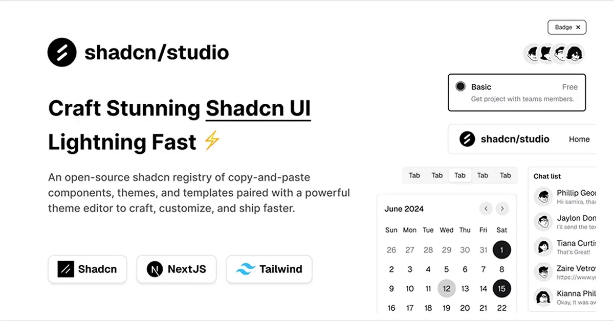
Shadcn/Studio - Theme Editor
Open-source Shadcn registry with copy-paste components.


Shadcn Chatbot Kit
Beautifully designed chatbot components based on shadcn/ui

Shadcn Svelte
Beautifully designed components built with Bits UI and Tailwind CSS.


StarterKitPro Blocks
Collection of ready-to-use, professionally designed UI blocks.


Shadcn Table
Shadcn table with server-side sorting, filtering, and pagination.

Shadcn Svelte Extras
Turn key shadcn-svelte components to help finish your app.

Tweakcn - Shadcn Theme Editor
Customize theme for shadcn/ui with tweakcn's interactive editor.

8bitcn/ui
Accessible retro components that you can copy and paste for your apps.

FormBuilder - Build Type-Safe Forms
Create beautiful, type-safe forms with our intuitive drag-and-drop

PasteCode: A Modern Code Sharing Platform
Pastebin alternative for sharing and saving text & code.

Dizzy – shadcn/ui themes generator
Customize Tailwind, add Google Fonts, export your design system.
.png?width=600&height=314&format=auto)

Shaduxe UI – Tailwind CSS Component Library for React
The ultimate extension for your shadcn/ui components.

Animate UI – Animated React Components for Tailwind CSS
Open-source animated React components with Motion & Tailwind CSS.

Components work: Components for React
Collection of components for Nextjs built using Tailwind and shadcnui.

Mixcn-UI
Modern, responsive UI component library built with React.
Explore the Extensive Collection of Shadcn UI Components
Welcome to the definitive collection of Shadcn Components — carefully designed, reusable UI building blocks that empower you to create seamless and consistent web interfaces. Whether you need buttons, modals, forms, alerts, or navigation elements, our components follow Shadcn’s philosophy of simplicity, accessibility, and flexibility, enabling you to build sophisticated React and Tailwind CSS applications faster and with confidence.
Why Use Shadcn Components in Your Projects?
ShadCN Components are built on the core principles of modern frontend development to provide you with:
Modular and reusable code: Easily integrate individual components or combine them to build complex UI patterns without redundancy.
Highly customizable: Tailor styles, behavior, and interactions to match your project’s unique branding and functionality requirements.
Accessibility-first design: Ensure that all users, including those with disabilities, can effectively use your application.
Performance optimized: Lightweight implementations that don’t compromise speed or responsiveness.
Consistent UI language: Maintain design uniformity across your entire application with components built to ShadCN standards.
Using Shadcn Components minimizes repetitive work, speeds up development cycles, and improves maintainability for long-term projects.
What Types of Shadcn UI Components Are Available?
Our growing library includes a wide variety of UI elements to cover virtually every interface need:
Buttons & Toggles: From simple clicks to complex stateful toggles.
Forms & Inputs: Text fields, checkboxes, radio buttons, selects, and validation helpers.
Modals & Dialogs: Accessible overlays for user interaction and messaging.
Navigation: Menus, tabs, breadcrumbs, and sidebars for intuitive app navigation.
Notifications & Alerts: Toasts, banners, and alerts to communicate status and feedback.
Cards & Lists: Content containers optimized for layout and readability.
Loaders & Spinners: Visual indicators to enhance user experience during loading states.
Each component is documented and tested for easy integration and customization within your ShadCN-powered projects.
Who Should Use Shadcn-UI Components?
ShadCN Components are ideal for frontend developers, UI/UX designers, and product teams who want to:
Build scalable and maintainable user interfaces with ease
Ensure accessibility and responsiveness by default
Customize components deeply without rewriting from scratch
Maintain consistent UI patterns throughout large applications
Accelerate time to market with ready-to-use, reliable components
Whether you’re working on small apps or enterprise-grade software, ShadCN Components give you the building blocks for success.
Why All Shadcn Components Collection Is Unique?
All Shadcn focuses exclusively on delivering high-quality ShadCN Components, ensuring:
Regular updates to align with the latest ShadCN and Tailwind CSS features
Thorough testing and documentation for every component
A dedicated platform that makes discovering, previewing, and downloading components effortless
Both free and premium offerings tailored to different skill levels and project needs
Conclusion
Our collection empowers you to create beautiful, consistent, and accessible interfaces faster than ever.
Browse the All Shadcn Components collection now and unlock the potential of modular, flexible, and accessible UI elements for your next project.
Frequently Asked Questions
Explore frequently asked questions about Components
Reusable UI building blocks built with React and Tailwind CSS, designed for accessibility and customization.
Install Shadcn components by setting up Tailwind CSS, installing dependencies, configuring your project, and using npx shadcn@latest add [component] to add components.
Have a product?
Submit your Shadcn product to AllShadcn, get featured, and drive genuine traffic while showcasing your work to the world. Turn your creativity into revenue and begin selling today! 🚀